Case study
Kindergarten’s Website Redesign
Project Overview
Role
Product Designer
Duration
July – September 2021
client
Kindergarten Tanvald
CMS
WordPress
Client & Challenge
Who is the client
My client is a public kindergarten, located in a small city and spread across three separate buildings. Each building has a manager who run their own activity plans, lunch menus, and other schedules. The kindergarten overall serves over 180 children and has over 20 employees.
Problem
Before being redesigned, each building had its own website, where they communicated information with parents and presented themselves. I identified a couple of issues that I wanted to resolve while merging the websites and delivering the product:
Inconsistent User interface
No cohesiveness and consistency
Speed issues
Contrast issues
Not responsive view for tablets and mobile devices
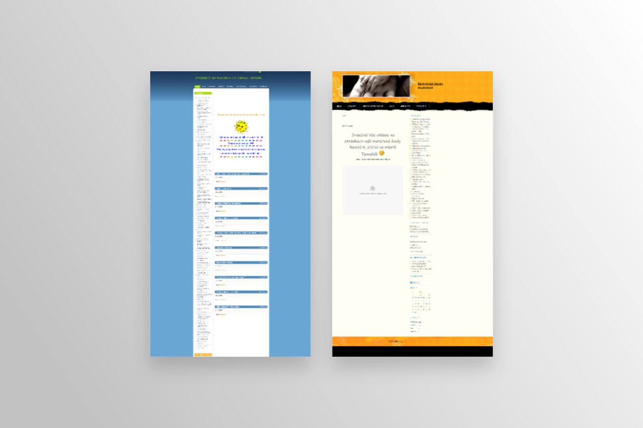
Example screenshots of the original websites for two buildings
Another challenge ahead…
As I started to create designs for the new unified website, another issue arose, the managers of each building felt extremely intimidated by having to work in a new CMS. As teachers focusing on educating small kids, they had little time to alocate to learning a new system. They claimed they were used to the old system and were not so confident they would manage to learn how to work in WordPress. Is it even possible to sort something like this? Yep, a piece of cake!
Considering the users
Who are the users
Users of the website are parents who visit the kindergarten on a regular basis. They usually look for information and updates, such as planned events, required payments, the weekly menu, and they really like to see photos of their kids having fun during activities organised by the kindergarten. I divided the information users are looking for into two categories; urgent search and casual browsing. An urgent search could be looking for a phone number to report an absence or looking at that day’s lunch menu. I also created a couple of scenarios that had an impact on the structure and content of the website. For privacy reasons, I will not share more information about this research.
Types of scenarios
Urgent situations
– Easy access to contacts to report absence or resolve urgent situations.
– Checking opening hours for unusual situations, for example public holidays.
Casual situations
– Looking for general information or to learn more about the kindergarten when deciding on their kid’s schooling.
– Looking for information to be ready for upcoming events.
– Looking to view the photo gallery or read about past events where their kid was involved.
– Looking to check the lunch menu to ensure their kid’s have a balanced diet.
Tasks to sort & Solution
Main task
Unify the design of 3 different websites and bring information straight to the parents.
Other tasks
Create a playful visual design with bright colors
Create a consistent visual style
Make the website easy to use so that parents find information they are looking for
Increase traffic of the website
Resolve speed and main accessibility issues
Find a way for teachers to easily create and administer 500+ posts a year
Solution
I created a website that brings together the content from the others, based on the simple site map I created. Together with a developer I also found a way for very easy uploading new posts without having to log in to WordPress and create posts in the Gutenberg editor, assigning the correct categories and other technical settings that make the posts appear in the relevant pages and sections. The teachers can upload posts, documents, and even photos via email, just simply by sending an email to the system with the right tags in the subject. I also managed to resolve the main accessibility issues and after review with each buildings’ manager, we launched the website. We decided that in two years’ time we would review the design and operation, with the view towards further revision.
Starting the design
Hierarchy
Since this is a small-scale site, creating a site hierarchy was straightforward. The website would contain a home page with information about the kindergarten, including its vision and other information parents are often looking for. Next would be pages for each building, including sections for opening hours, reporting an absence, sharing updates, events, current lunch menu and photo gallery. Another page would be for legal and policy documents, divided by the type of document either for parents or the kindergarten. The last page would be for contacts, where parents or other users could easily find details on bulding managers and for each class with the kindergarten.
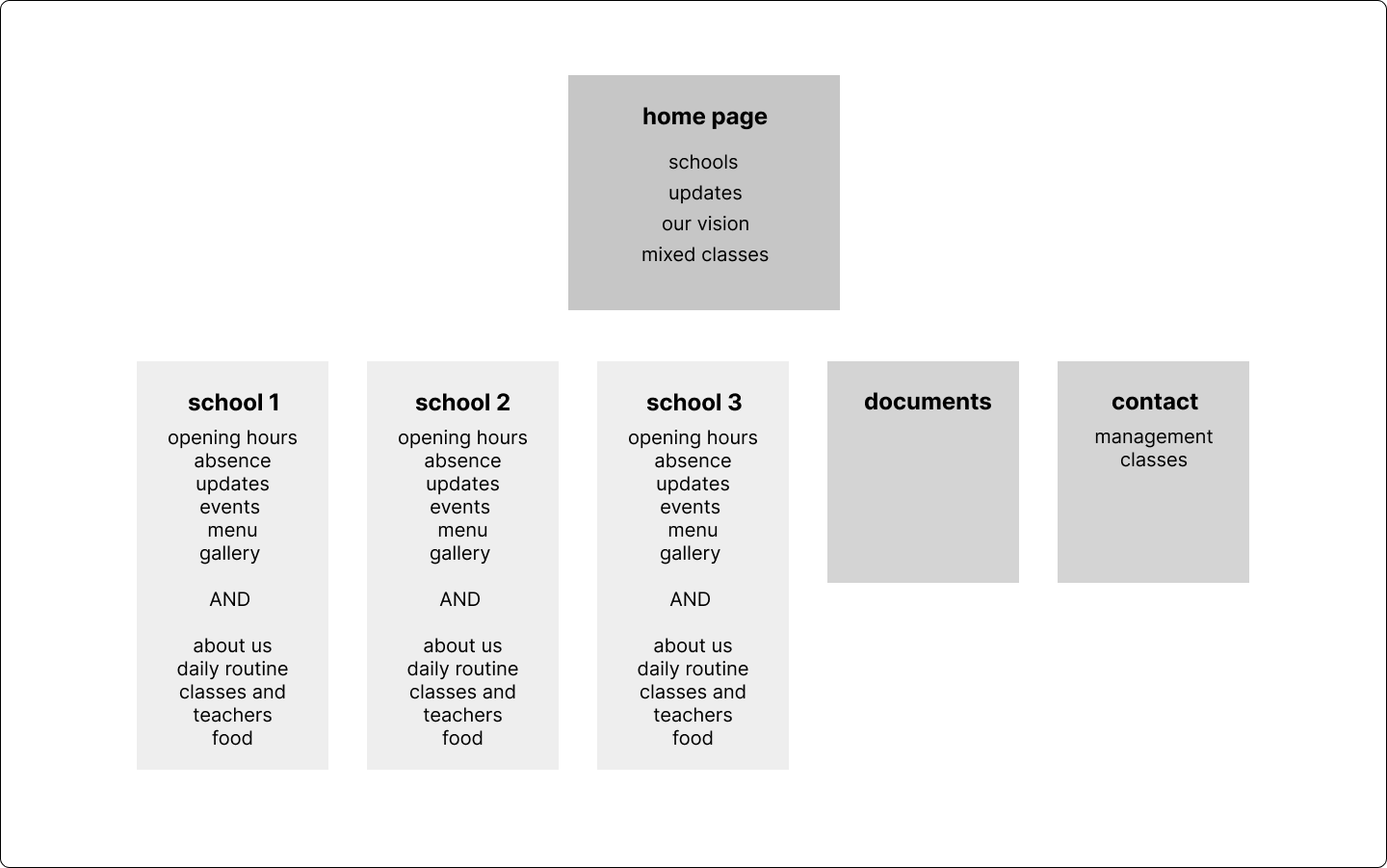
Page hierarchy draft for kindergarten website redesign
The header with navigation includes all buildings, documents, and contacts. The item for Home was added after it became apart that most users did not know that clicking on the logo would return them to the homepage.
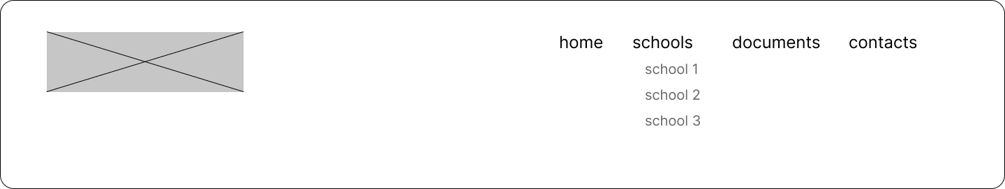
Basic navigation draft for kindergarten website redesign
Low-fidelity wireframe
I created a simple visualization of the website with information on what would be included on each page. Then a single buildings’ page was created. I wanted to have the most important information at the top on mobile view, so I created a two-column layout with updated information on the left and the rest of the information on the right on desktop/tablet devices, with the left column at the top for mobile devices.
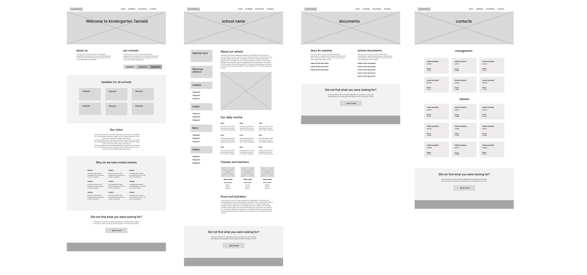
Low-fidelity wireframe with information included on each page
Visual design
Typography and colors
For typography and colors, I chose playful font faces and bright colors, that represented the ideas and nature of the kindergarten. For fonts, I needed to ensure that both the fonts for the header and body text have special signs that are used in the Czech language (ěščřžýáíé).
Barrio for headings
ěščřžýáíé
1234567890
Atma for body text
ěščřžýáíé
1234567890
#f70593
#17d201
#fe7c02
#0052cc
#242424
Mood and imagery
The visual design on the website needed to fit both the purpose and the feeling of the kindergarten. I wanted a playful, maybe a little bit childish, mood while using authentic pictures as much as possible. Where I could not use realistic pictures I chose photos from Pixabay that match this mood.
Final design
Picking the template
As part of the contract, I was going to create a template-based website due to a limited budget. Based on the wireframe shown above, I started to look for a template that would be the best match for what I wanted to create a communicate. Even though there are thousands of website templates, I did not expect to find a perfect template that would need no changes. I picked the one that was the closest and made changes according to my wireframes, implemented visual design, and made sure the website was responsive.
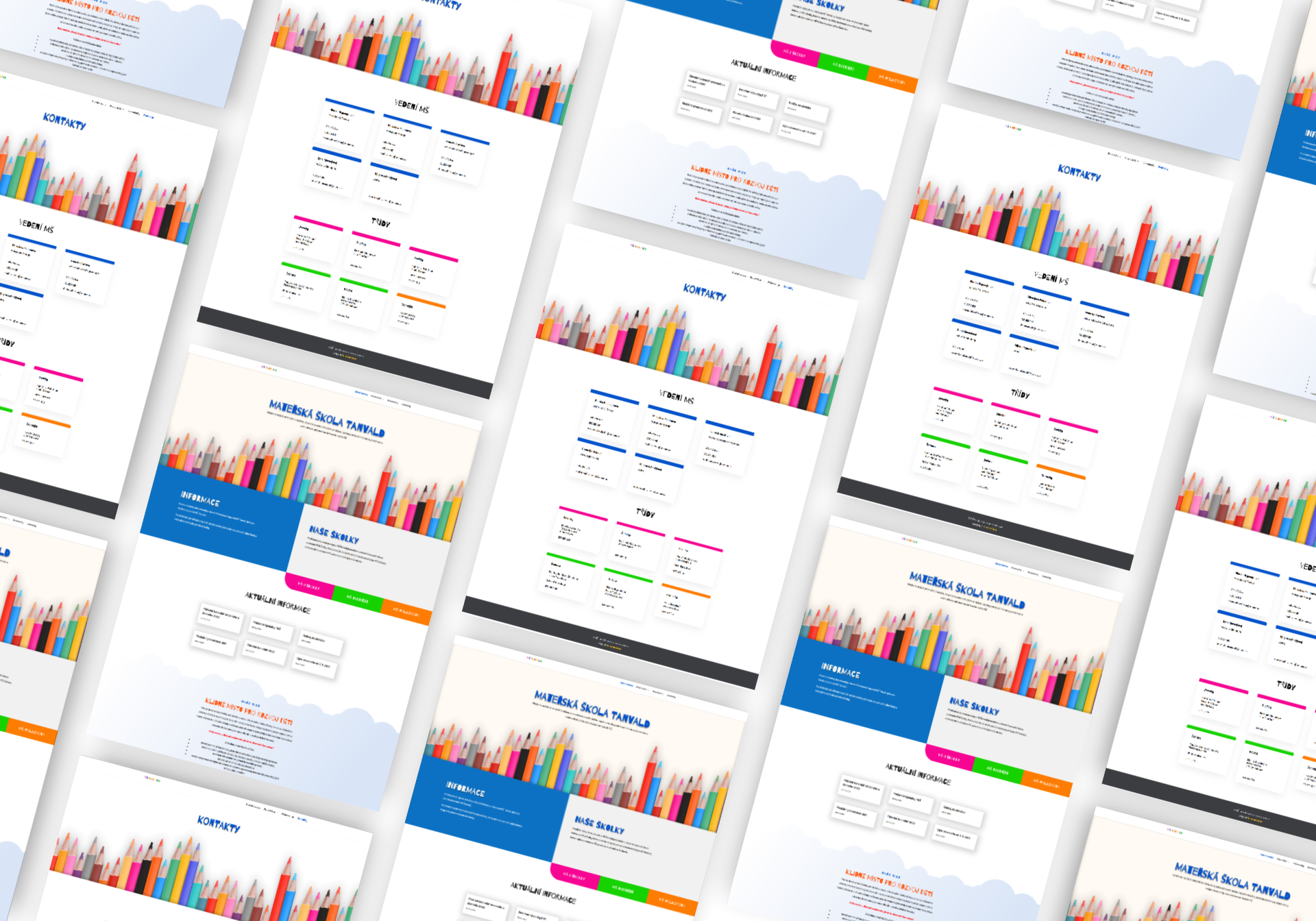
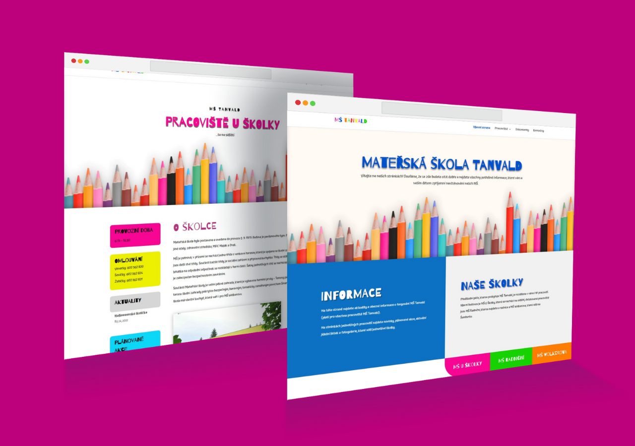
Mockup of the final design of kindergartens website redesign
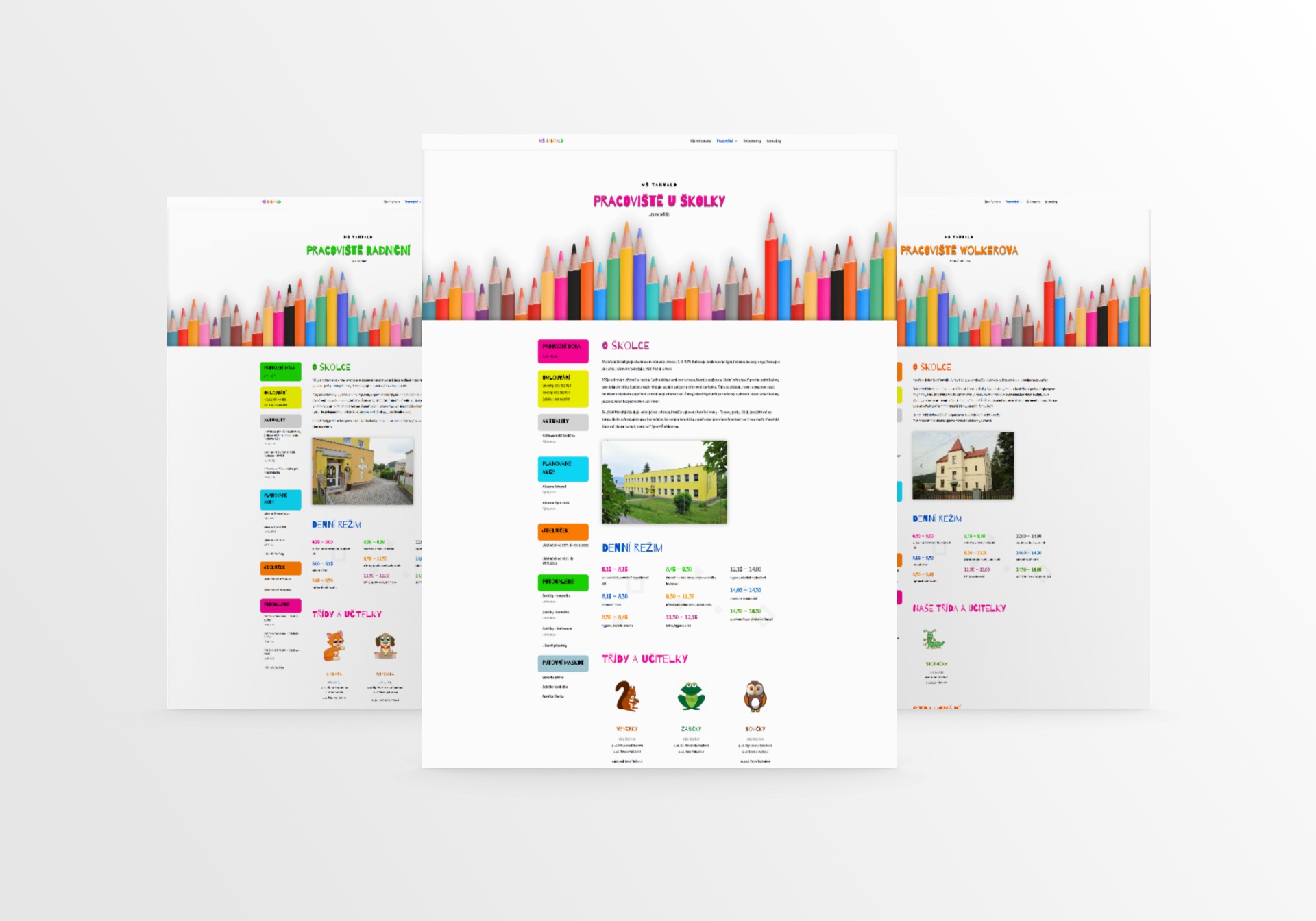
Pages for each school
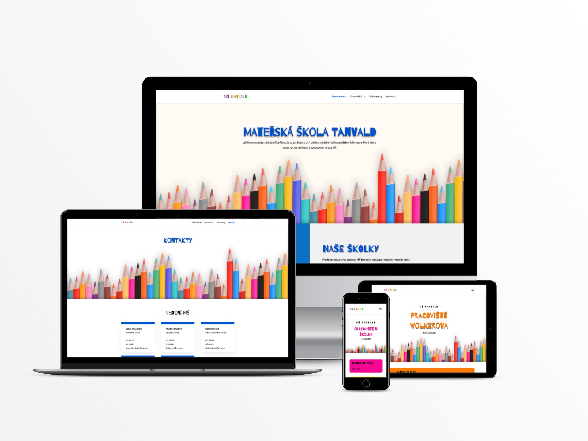
Responsivity visualization for each page (mobile, table, laptop, desktop)
Technical health
Core Web Vitals
For both desktop and mobile view Core Web Vitals show good results.
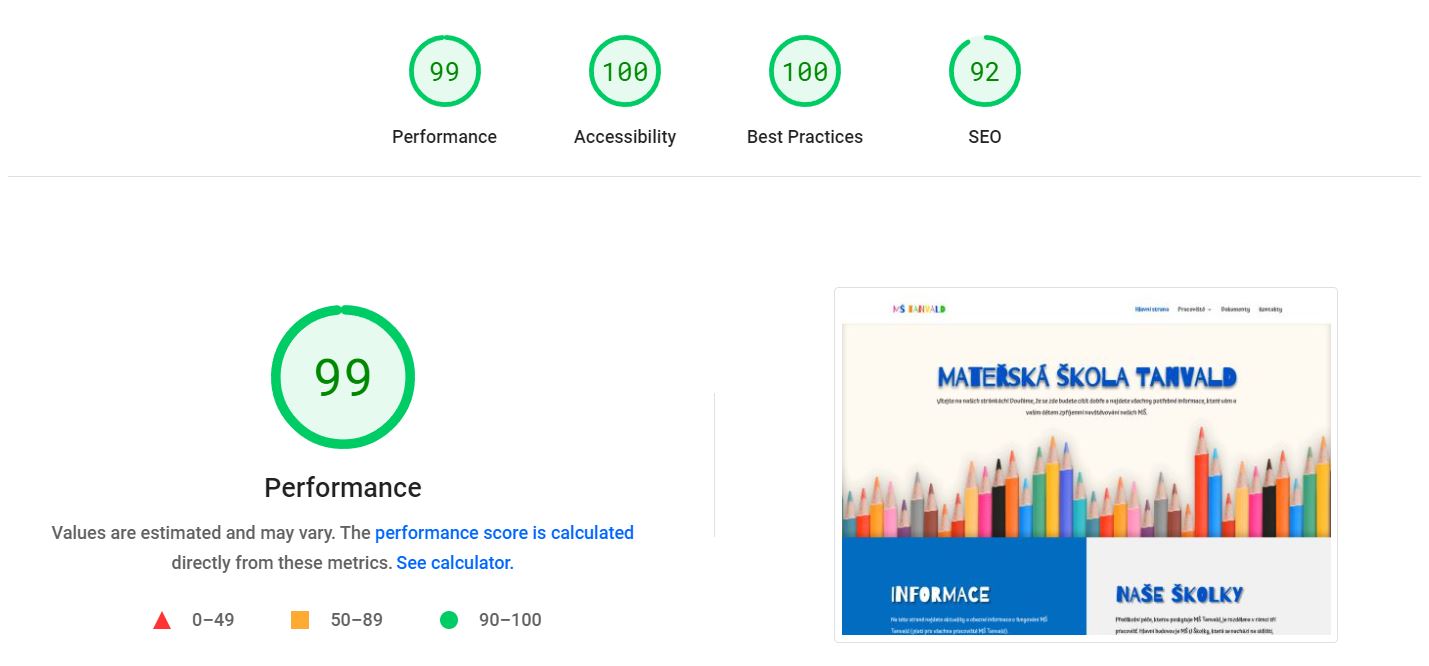
Results from Page Speed for desktop for Kindergarten website
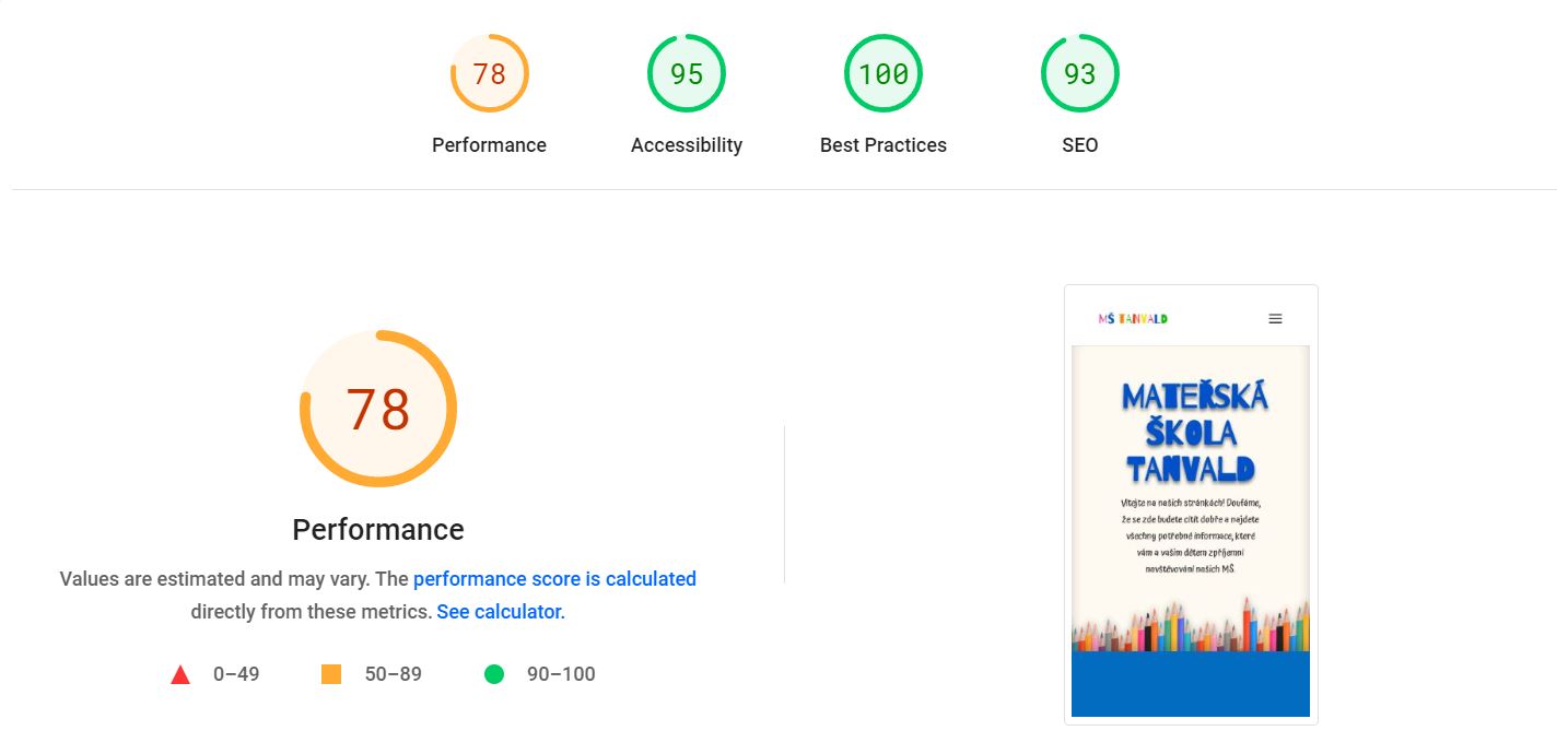
Results from Page Speed for mobile devices for kindergarten website
Graphic design
Logo & Logotype
As part of the deal, I created a logo and logotype for this project. The idea of the logo is based on the kindergarten’s location, which is in the mountains. Another element, which is the kids and the sun, comes from the idea of the school’s education program, which is called “Walking together in the sun”.
As an extra for this project, I created business cards that match the website’s visual design and go well with the idea of kindergarten, playfulness and happiness.
Logo visualization
Logo (logotype) on a pen visualization
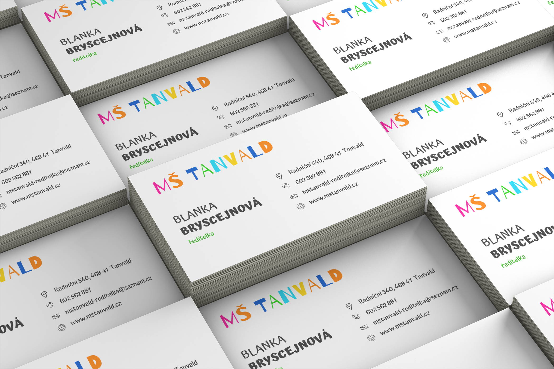
Playful business cards for the principal of the kindergarten
What does the client say
“Our first collaboration with Mrs. Kennedy in the summer of 2020 turned out to be absolutely excellent. Despite the fact that we only met a few times and relied on phone or e-mail communication throughout the solution to the implementation of our website, mutual communication worked perfectly. We especially appreciate her promptness, care, patience, willingness and also a high dose of creativity, which brought a completely new dimension to our website. Together with my colleagues, we can warmly recommend her work, Mrs. Kennedy is a professional in every inch, and any non-standard wishes will not put her off. Our cooperation will certainly continue in the future.”
Blanka Bryscejnová, principal
What did I learn
Content analysis
This was the first time I redesigned multiple websites and unified their design into one, representing one organization. I analysed the content on all the previous websites and based on my findings offered a solution that works well.
Accessibility
As my client is a government organization, they are subject to accessibility regulations. Thanks to this project, I learned a lot of not just user-focused, but also formal rules that will help me when working on other projects.
Next steps
What I recommend to do in the future
Usability study
Conduct usability study in a few month’s time to validate whether the pain points users experienced have been effectively addressed.
User research
Conducts more user research with the parents on a regular basis to determine any new areas of need. Recommended on a yearly basis.
Continuous improvement
Continuously improve the website in accordance with usability study and research.
Watch Regulations
Track the rules and regulations that apply to the websites of government organizations and compare whether these websites meet the current requirements