Case study
Minimalistic E-commerce store
Project Overview
Role
Product Designer
Duration
October 2022 – November 2022
client
Tomas Marek
CMS
WordPress
WooCommerce
Client, Challenge & Solution
Who is the client
Tomas Marek is the owner of a farm located in the Vysocina region in the Czech Republic. The farm has a long family history and has oriented towards organic farming from the beginning, so Tomas has a naturalistic mindset. Tomas owned a self-designed e-shop created on another platform, where he sold a variety of products; high-quality bio chocolate, nuts, and spices. Tomas is always taking steps to reduce his own and his customers’ impact on the environment and has a highly sustainable business. His suppliers are first-point fair-trade farmers, he recycles his wholesale materials, and packs in plastic-free paper bags.
Challenge
The self-designed solution of his e-shop looked good, but it no longer met Tomas’s requirements, especially technically, but also his design was looking stale. We engaged in 2021 to redesign his site and created an e-shop that was easy to administer, fully automated and that more accurately conveyed his naturalistic philosophy to his customers. In 2022, he engaged with me again to design a new e-shop to target the German market. The requirement was to create something minimalistic based on the current design, and unify the e-shops so they are consistent and coherent.
Solution
I created a website that is simple, minimalistic, and in line with eco and bio philosophies in many ways. The e-shop is easy to navigate and has no unnecessary information, and very good technical functions for both customers and Tomas. Changes in design that were made in the German version were transferred into the Czech e-shop to maintain consistency.
Considering the users
Who are the users
I conducted secondary research to understand the user, focused on sustainable shopping and bio products. According to this study, for example, consumers shopping for sustainable brands do so out of a desire to help the environment, mostly by reducing production, shipping and packaging waste. The reasons for preferring sustainable products, apart from environmental concerns (29%), are value (25%), brand authenticity (22%), and personal values (19%). An interesting finding is that pricing is not as important to consumers as retailers believe.
So, what are our two primary user stories?
1. As a person caring about nature, I want to shop for environmentally friendly products, and so I feel good about supporting sustainable businesses and fair trade.
2. As a health nut, I want to buy high-quality bio products, so that I can achieve my nutrition goals by eating a healthy diet free from preservatives, additives, or toxins.
Starting the design
I drafted a simple header, including a primary header with a logo and anchors to the sections on the home page. The secondary header above it includes quick email access, shopping features like free shipping and additional discounts break-points, and a cart icon with the number of items currently placed in it.
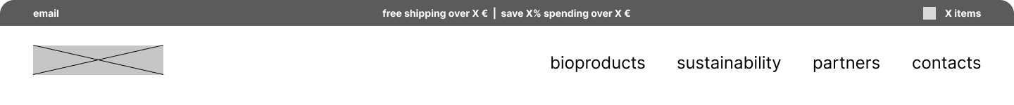
Basic navigation draft for Chocolate Farm e-commerce store
Low-fidelity wireframe
I also drafted a visualization of the home page as a lo-fi wireframe. Considering the e-shop was going to have a small number of products at its maximum, we agreed to create just one page with a full product listing. At the bottom of the page was placed additional information about sustainability, packaging, and the quality of the products. Other pages for product page, cart and checkout would be WooCommerce default pages with some changes to improve the customer experience.
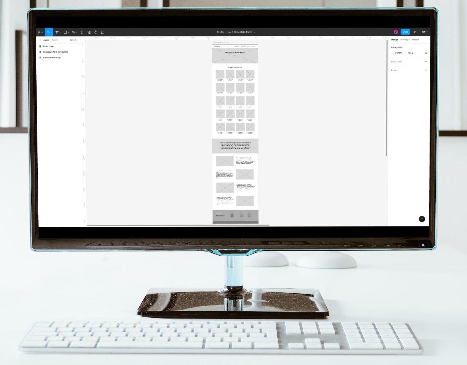
Low-fidelity wireframe for Chocolate Farm e-commerce store
Visual design
Typography and colors
Typography was taken from the visual style of the redesigned Czech e-shop. I needed to ensure that both the fonts for the header and body text included special characters used not only in Czech (ěščřžýáíé) but also in German (äöüß). For Roboto and Raleway I did not expect any problems and it turned out to be a great choice. Colors were simplified; from an 8-color palette, we decided to use just 5 colors, including neutral colors and the color for texts, that matched well with the product pictures.
Roboto Bold for Headings
äöüß
1234567890
Raleway for body text
äöüß
1234567890
#6b352b
#e3dbd8
#f4f1ef
#5f818f
#393939
Mood and imagery
The overall impression of the website should be “simplicity and minimalism”. For product pictures, only good quality, well-represented images would be used. Tomas was able to supply these and were of well suited to the design.
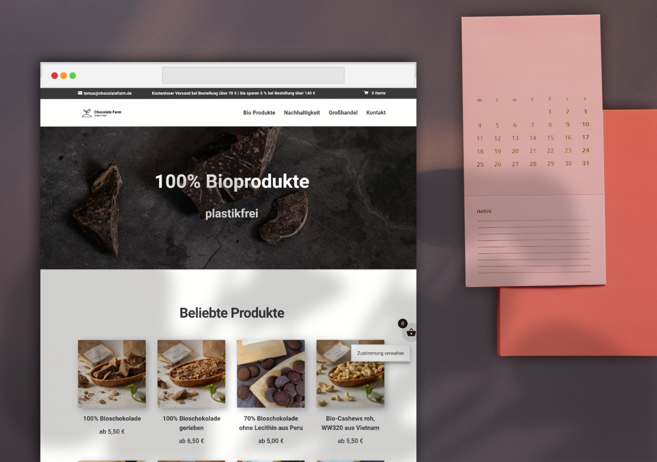
Final design
Creating the designs
Based on the wireframe and the visual style, I created a home page for the e-shop. The pages for the product, cart, and checkout were based on default WooCommerce but adapted to the design. Tables with information about the product and nutritional data were coded into the description on the product page. For better user experience, especially when shopping via mobile phones, we added easy access to the items in the cart or to proceed directly to the checkout. This is achieved through an icon at the bottom of the screen, which opens with an overview of the cart after adding an item or clicking on it.
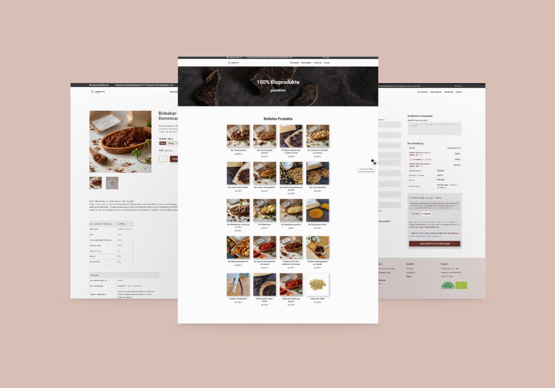
Mockup of the final design of Chocolate Farm e-commerce store
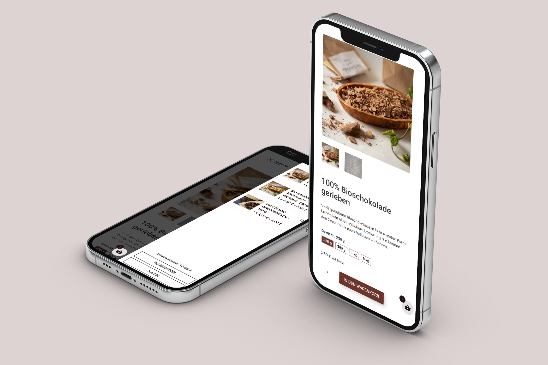
Mockup of the product page with visualization of the side card on Chocolate Farm store
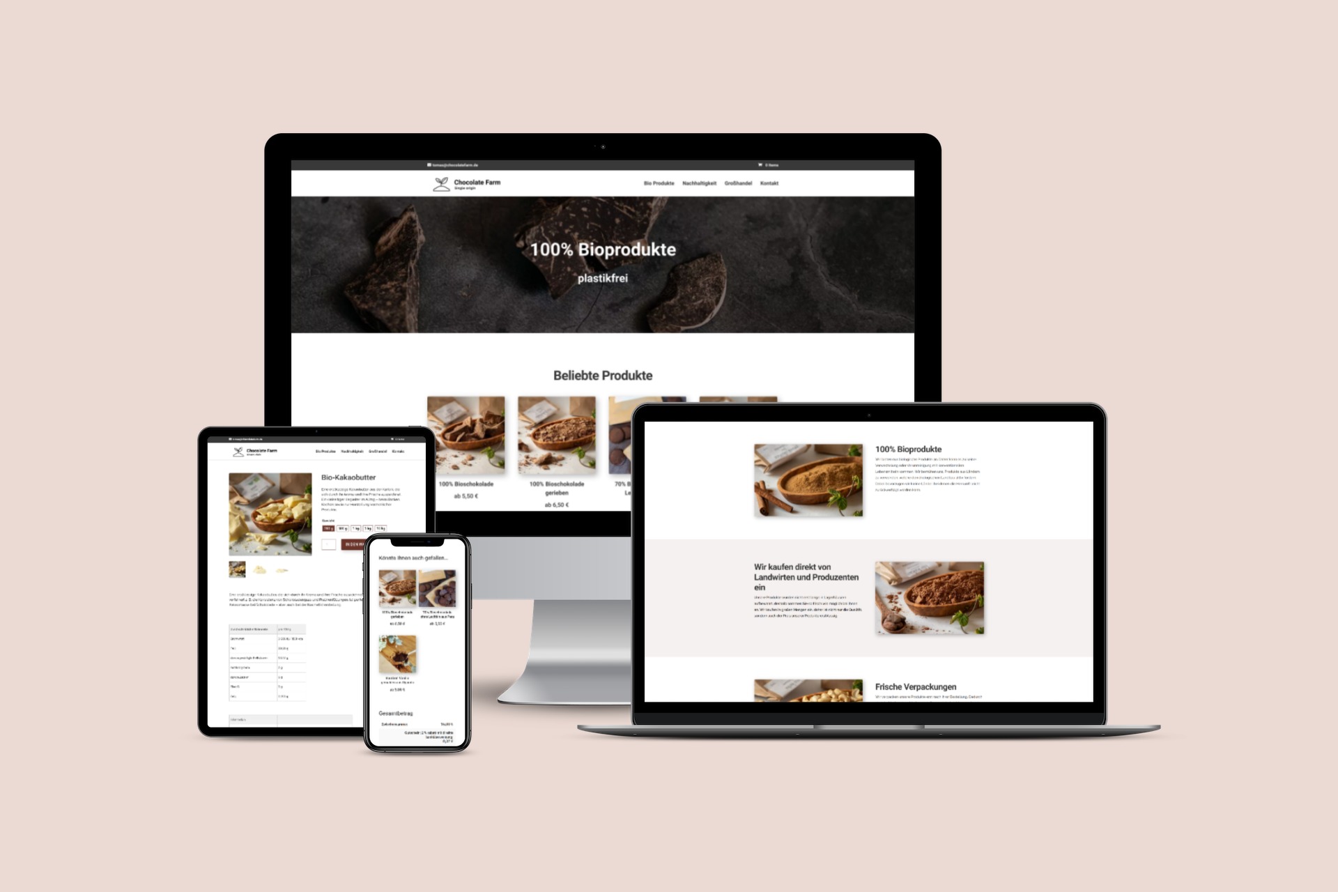
Responsivity visualization for Chocolate Farm (mobile, table, laptop, desktop)
Technical health
Core Web Vitals
For both desktop and mobile views, Core Web Vitals show excellent results, which support both good user experience and search engine results.
Results from Page Speed for desktop on Chocolate Farm store
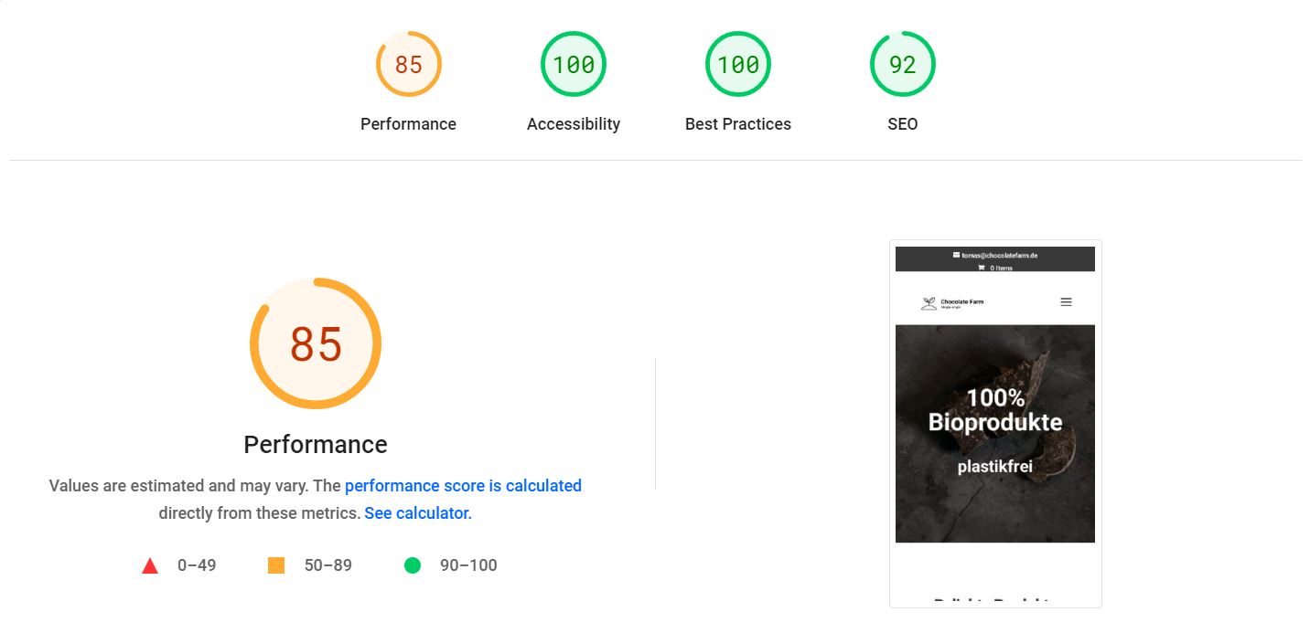
Results from Page Speed for mobile devices
What does the client say
“Petra and I have worked already on a second website on CMS WordPress. We managed to build a website that meets all of our design and functional requirements. She managed to implement all the gadgets that we come up with and constantly move the website forward. Communication with Petra is excellent and, thanks to her experience, she often suggests solutions that we would not have thought of. Our second website took about a month from initial consultation to website handover, and we look forward to the next project.”
Tomáš Marek, owner
What did I learn
Ultra-minimalistic design
The minimalistic design required by Tomas was in contrast with those of some other clients, who often look for busy designs. I found this project very interesting because of the minimalism. I am very happy with how it turned out; super-clean design that fits perfectly with the idea of sustainability and bio products.
Unifying design for multiple websites
Based on the design of this new website I unified the look of both websites. Working on the redesign at the same time reduced the time taken as knowledge was quickly carried across, but it was still a great experience in synchronicity.
Next steps
What I recommend to do in the future
Track traffic
Track traffic on Google Analytics to get data about visitors and metrics like bounce rate and conversions to detect a possible issue.
Usability study
In case Analytics implies there is a problem for the users, perform a usability study to find out what prevents users from finishing their conversions.