Case study
App and Website Design
Project Overview
Role
UX Researcher
UX Designer
Duration
Oct 2021 – Jan 2022
client
Self-initiated
(Google UX Design Course)
Software
Figma
The Product
This project was created to help students and adults get comfortable while speaking publicly. The final product is a dedicated application and a responsive website.
My responsibilities
Conducting interviews, creating paper and digital wireframing ofr both the application and website, low and high-fidelity prototyping, conducting usability studies, accounting for accessibility, and iterating on designs.
The Problem & The Goal
The Problem
Based on the available results of external research, it was proven that 75% of adults feel distressed before their public speech. 90% of them also say that good preparation helps them to perform better.
I created a dedicated application for speech preparation, which contains videos and features that help get ready in an interactive way. In addition to the application, a website has been created that helps raise public speaking best practice awareness and also helps promote the application.
The goal
The aim of the project was to create a solution for public speaking preparation with interactive features, focused on good user experience and real usability of the product. The product was designed with a user-first approach and is focused on users‘ needs and expectations. Continuous research performed throughout the design process helped refine the functions in order to help users get comfortable before and while giving their public speeches.
Understanding the users
Summary of user research
For this project, survey, interviews, and empathy maps have been created to understand the users that the product was being designed for and their needs. A primary user group identified through research were high school and university students and adults who don’t feel comfortable giving
a public speech.
Based on the main target groups, I created two personas to better understand users‘ needs and keep the personas in mind while creating the product.
User research: pain points
Overwhelming negative feelings
Users feel overwhelmed with negative feelings before they start preparing their speech.
No sure how to get ready
Users are not sure where to start and feel stressed about the whole process.
No opprtunities to practice
Users claim they do not have any opportunity to practice and get feedback which would help them get more comfortable.
Persona 1: Peter
Peter is an introverted student who looks to improve his public speaking skills because he does not feel comfortable speaking in front of a lot of people.

Persona 2: Margaret
Margaret is a professional who seeks mentorship in public speaking because she feels she needs to revive her strong skills that would help her perform better at work and get promoted.

Competitors’ Review
Competitors’ Apps
I reviewed a couple of apps available on Google Play Store, e.g. Public Speaking for Beginners & Advanced, and Master Public Speaking. Both apps are information based, containing just texts. Design is basic, in some cases feels outdated and rather unattractive. None of the audited app are interactive in any way.
I saw a great opportunity in designing an interactive app with modern UI and features that really help users get better in public speaking.
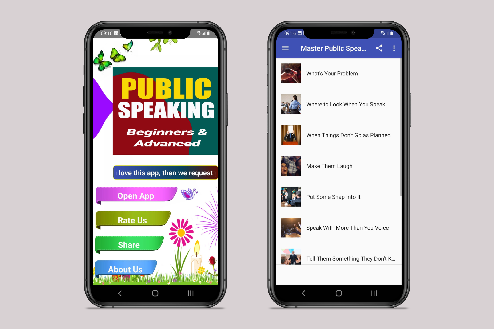
Examples of public speaking apps available on Google Play Store
Ideation
Based on findings in initial research and competitive audit, I did a quick ideation to come up with ideas for how to address identified gaps.
My focus was specifically on interactivity with features that help users improve their skills and get more confident.
The main features are recording the speech for self review with an option to get feedback from a registered mentor. Another key feature in checklist that helps go through the preparation process, with a progress bar that has a motivational function.
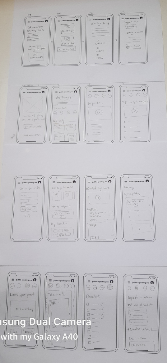
Initial ideation; paper draafts
Starting the design
Initial draft
Digital wireframes have been created for this project to ensure that the app and website have the required functionalities and provide a better idea of what the app will look and work like.
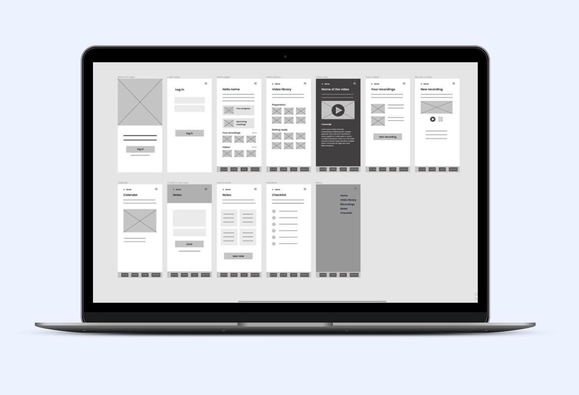
Lo-fi wireframe for Public Speaking Project
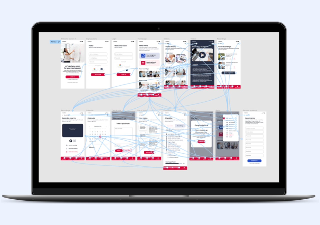
Low-fidelity prototype
To prepare for usability testion of the app, a low-fidelity prototype was created. The prototype connected the user flow of viewing the main functions.
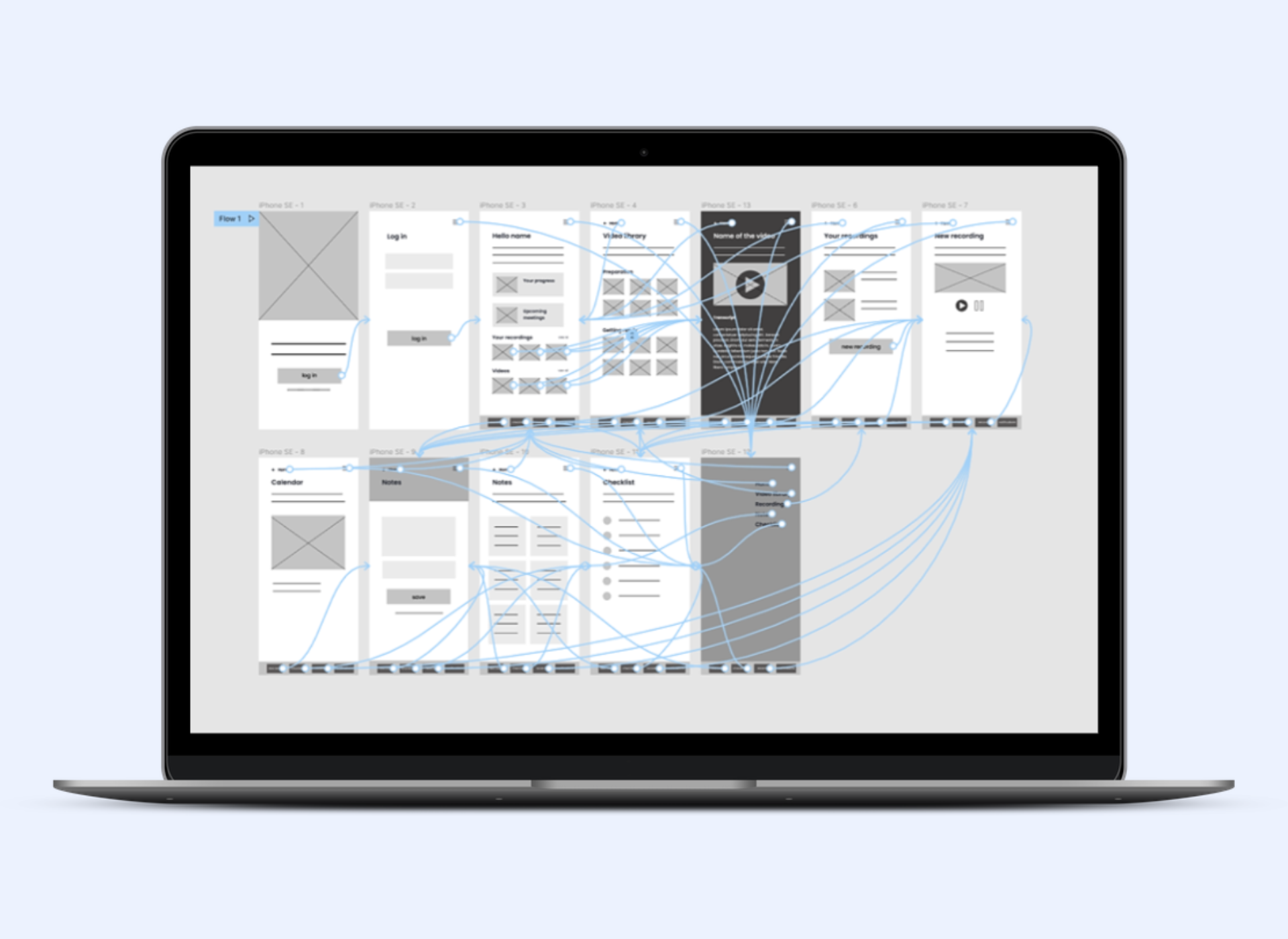
Low-fidelity prototype for Public Speaking project
Usability study
After creating lo-fi wireframes and prototypes, I conducted a moderated usability study with 5 participants, conducted online (remotely with sharing screens). Average duration of one session was 20 minutes.
Findings of the usability were the following:
Users would prefer a better navigation for some items, such as accessing adding a new note from the screen with notes.
Add a link
Users suggest there should a link of “view all” in the section with videos and recordings, that are on the home screen.
Missing hi-fi design
Most users complain about missing graphic elements as they cannot imagine the final product (which will be sorted in the second round of usability study with the high-fidelity prototype).
Changes
Before I started to work on hi-fi mockups, I changed the design according to the users’s feedback. I added a button for creating a new note to the list of notes so it is more easily accessible from the notes screen.
On the home screen, I added links leading to all recordings and videos. The links can be found on the right side on the same row beside headings.
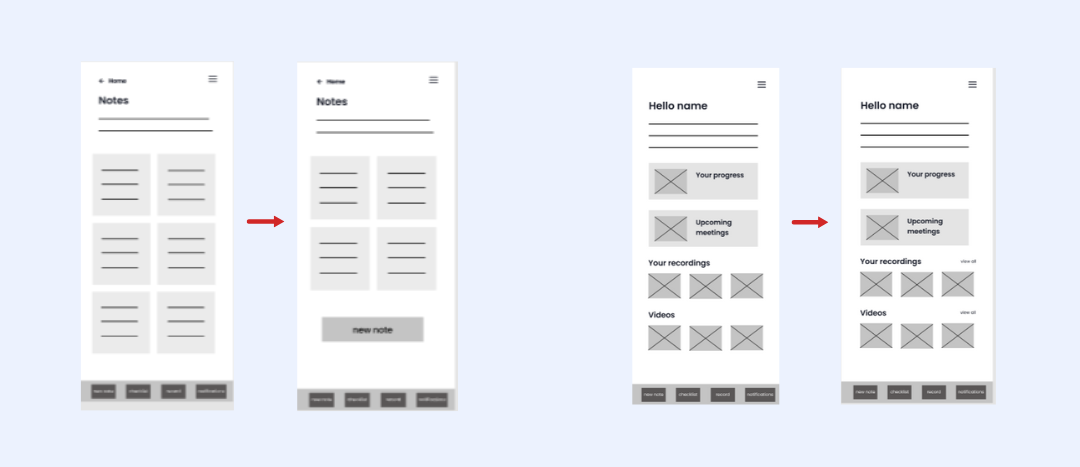
Changes made to the screens according to usability study findings
Visual design
Typography and colors
For typography, I chose Poppins as a popular font that is easy to read, with a geometric and clean style. Poppins have a variety of weights that allow me to distinguish the order of information. It is a modern and professional font, applicable to both heading and body texts.
For colors, I chose a reddish pink and blue with their shades, and a dark shade of blue for texts. The red color is to represent passion, attention and tenderness. The blue I chose to make an impression of calmness, trust, security and order. All together they are the perfect match for my project.
Poppins for headings
1234567890
Poppins for body text
1234567890
#da0037
#fdeef1
#7189d1
#2850c8
#141825
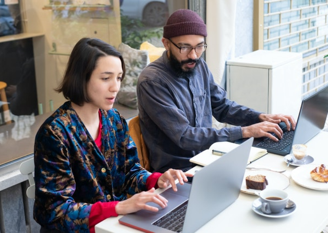
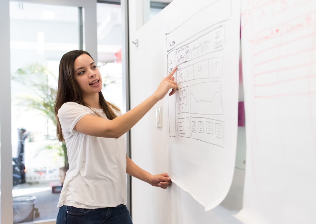
Mood and imagery
The overall impression should make an impression of professionalism, education, and modern education. The set images used should be consistent and show enough diversity, as I design for all users. Examples of the images are as follow.
Imagery 1

Imagery 2

Imagery 3
Imagery 4

Imagery 5
Mockups & Hi-fi prototype
Mockups
Based on the wireframe and visual style, I created about 15 screens for my app project, which of the key mockups I am sharing below.
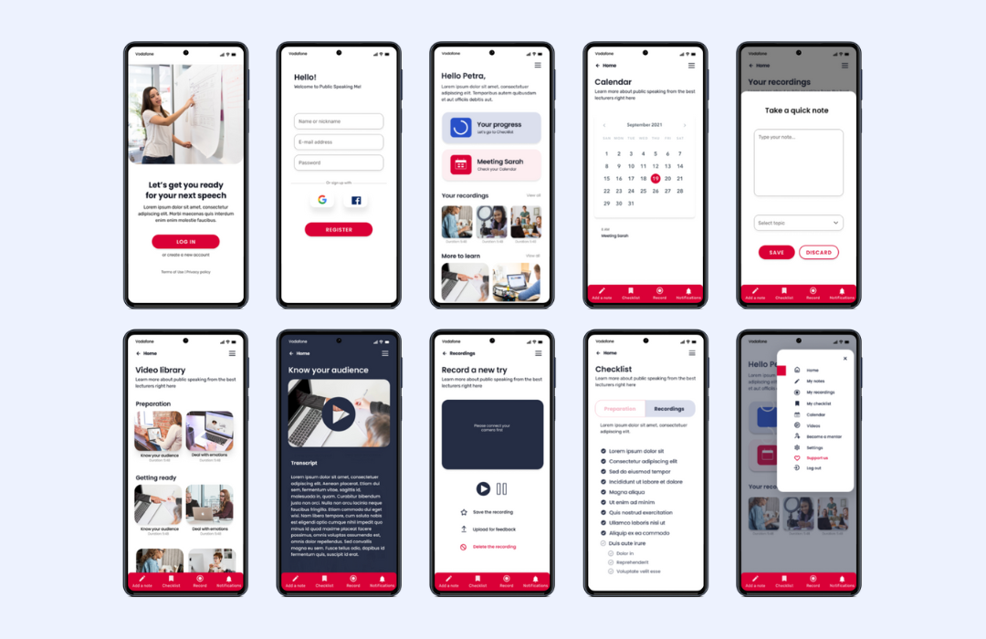
10 screen mockups of the new app for Public Speaking
High fidelity prototype
A final high-fidelity prototype reflected insights from the research and usability study. The hi-fi prototype followed the same user flow as the low-fidelity prototype, including design changes made after the usability study.
10 screen mockups of the new app for Public Speaking
Accessibility considerations
A final high-fidelity prototype reflected insights from the research and usability study. The hi-fi prototype followed the same user flow as the low-fidelity prototype, including design changes made after the usability study.
Contrast
Colors were chosen in accordance with contrast ratio standards.
Fonts and size
Fonts Poppins and Rubik are easy to read, and size is big enough to be comfortably read for most users.
icons and imagery
The prototype includes icons and pictures to help make navigation easier.
Logical structure
The prototype provides good technical background for screen readers.
Responsive design
Sitemap
Having finished the app prototypes and mockups, I started to work on designing a responsive website. I created a Public Speaking Me sitemap to guide the structure of each page to ensure a cohesive and consistent experience across devices.
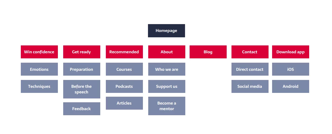
Infomation architecture of the website for the Public Speaking project
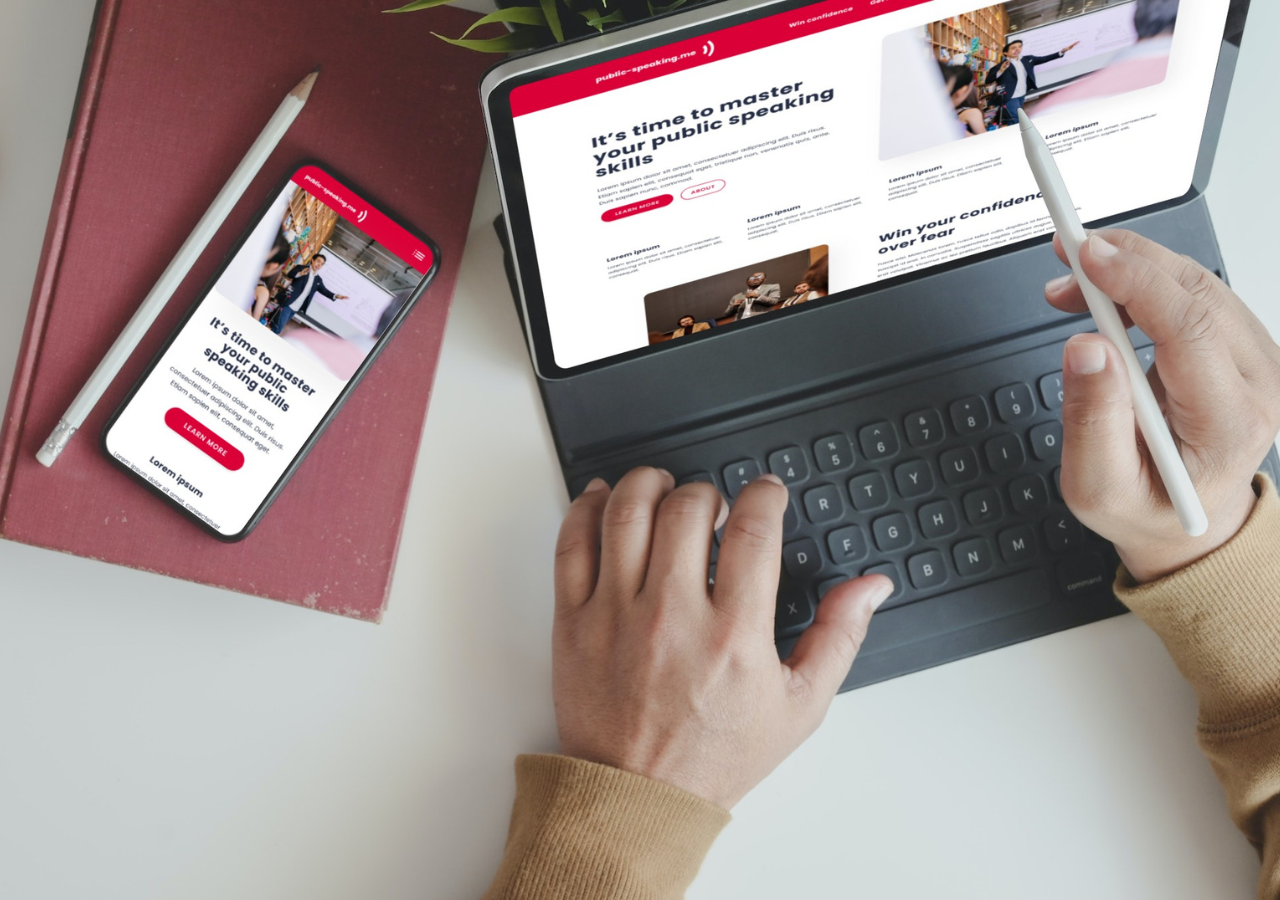
Final design
I created pages for desktop, tablet and mobile view.
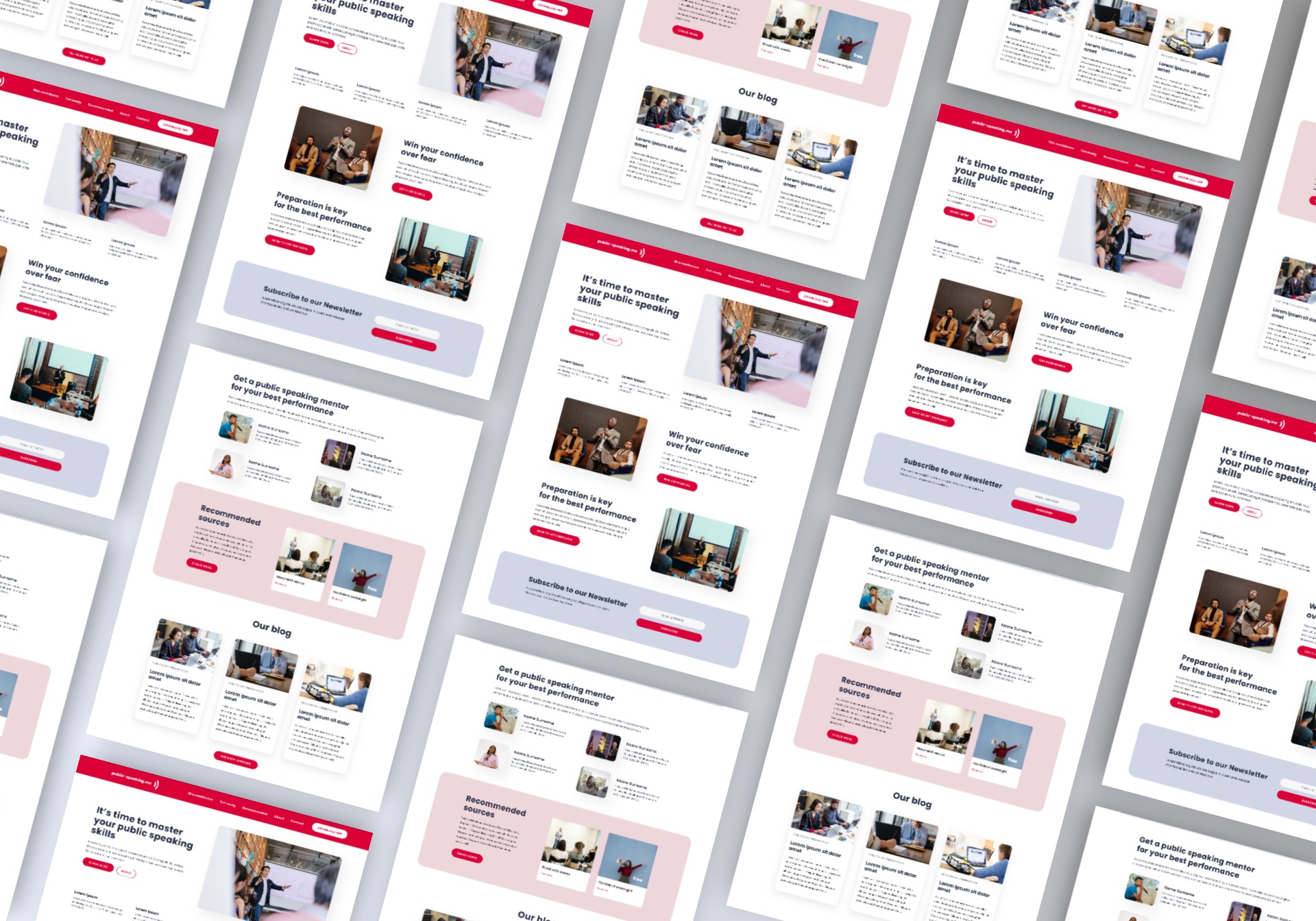
Responsive design for desktop for Public Speaking Project website
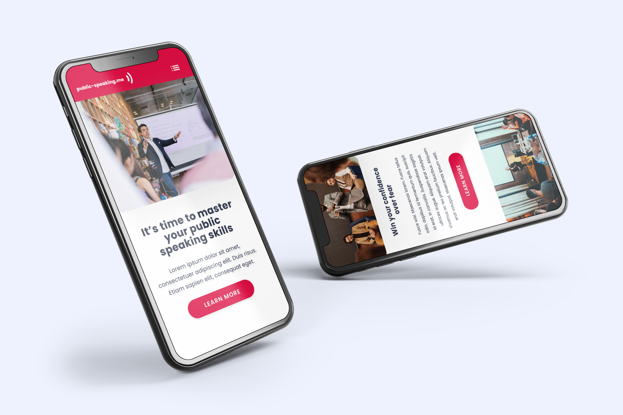
Responsive design for mobile devices Public Speaking Website
Takeaways
Impact
Dedicated application and the responsive websites complement each other. The application will help users prepare for their speech and the website will help to understand the principles of public speaking. I expect the product have a huge impact because speaking skills are a metaskill for anyone who want to succeed in the global world.
What I learned
Working on this project, I learned to distinguish between the application’s and the website’s goals. Thanks to focusing on interaction with users I was able to refine the products to fit the users’ needs and avoid my own biases. At the start I had a little different ideas about the whole project but thanks to talking to the users I managed to change the direction and created a product that offers a functional solution to the users’ expectations.
Next steps
What I recommend to do in the future
Usability study
Conduct another usability study in a few months time to validate whether the pain point users experienced have been effectively addressed.
Continuous improvement
Continuously improve the app and website in accordance with usability studies conducted on a regular basis to ensure the product meets the users’ and business needs.