
Typography System
Role
Designer
Duration
January 2022
Client
Self-initiated
The Typography System is a project to complete a UXCEL challenge for designers. The aim of the challenge is to create a typography system for a marketing website in the gaming industry that reflects the brand image.
Given scenario and a task were: You’re a UI designer and received a task to design a typography system for the Placid Plastic Duck Simulator marketing website. This niche video game follows a unique concept and doesn’t really have competitors. The players watch plastic ducks falling into an outdoor swimming pool while relaxing music is playing in the background.
Create a typography system with 5 levels of hierarchy: display, heading, subheading, body text, and button text. Use no more than 2 different typefaces. The design needs to be modern, fresh, and reflect the brand image. Use Figma or another appropriate design software and export the result in .pdf.
01/ Current state and typography usage
Who are STEAM
STEAM is an online gaming platform, offering thousands of games for playing or as a creative environment. Visual design is in a dark theme, looks modern, fresh and playful.
Placid Plastic Duck Simulator is one of Steam’s latest hits, launched last summer. The game is supposed to bring the user relaxation. What’s surprising is that the game itself and its page look quite old-fashioned.
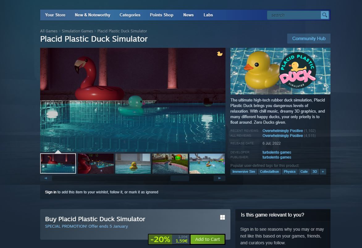
© STEAM®, screenshot of Placid Plastic Duck Simulator page
Current color palette
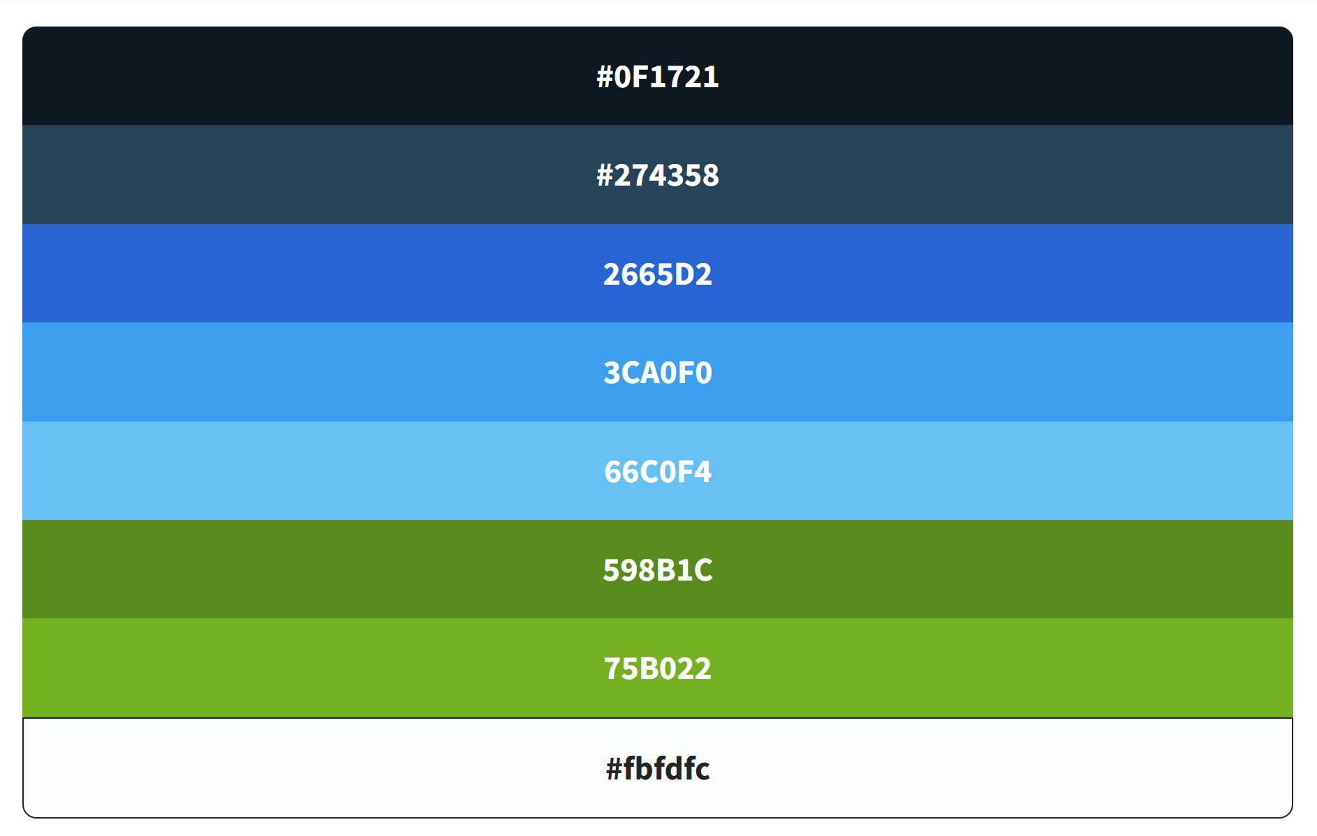
Image: duck simulator color palette
Types of Content
The page features a variety of text elements including headings H1 and H2, body text, breadcrumbs, buttons, linked text, and lists. This diverse range means it won’t require many different typefaces to use.
Instead, to create a clear hierarchy and differentiate various types of information, I will utilise bold text, distinctive colours as seen in the current design, and capitalisation, all of which do not rely on multiple typeface variations.
Accessibility Concerns
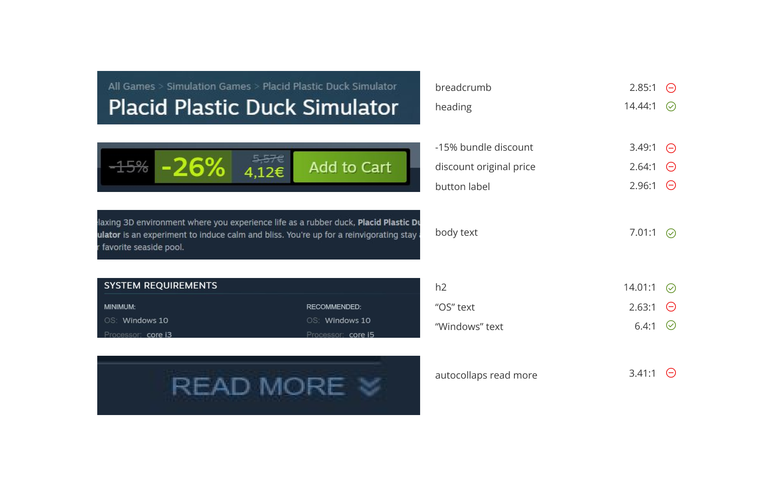
Image: color contrast ratio check of 10 random text elements, failing 6/10
02/ New Typography System Suggestion
Choices Explanation
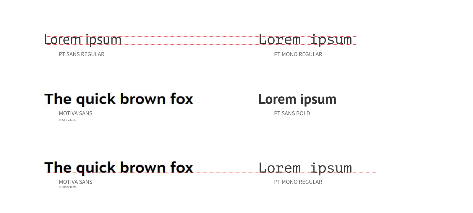
Image: x-heights for chosen fontfaces of PT Sans and PT Mono in comparison to Motiva Sans
Typography System visualization
I have designed a Typography System that encompasses five essential levels: display, heading, subheading, body text, and button text. This system not only reflects our brand identity but also ensures colour contrast for enhanced readability and visual impact.
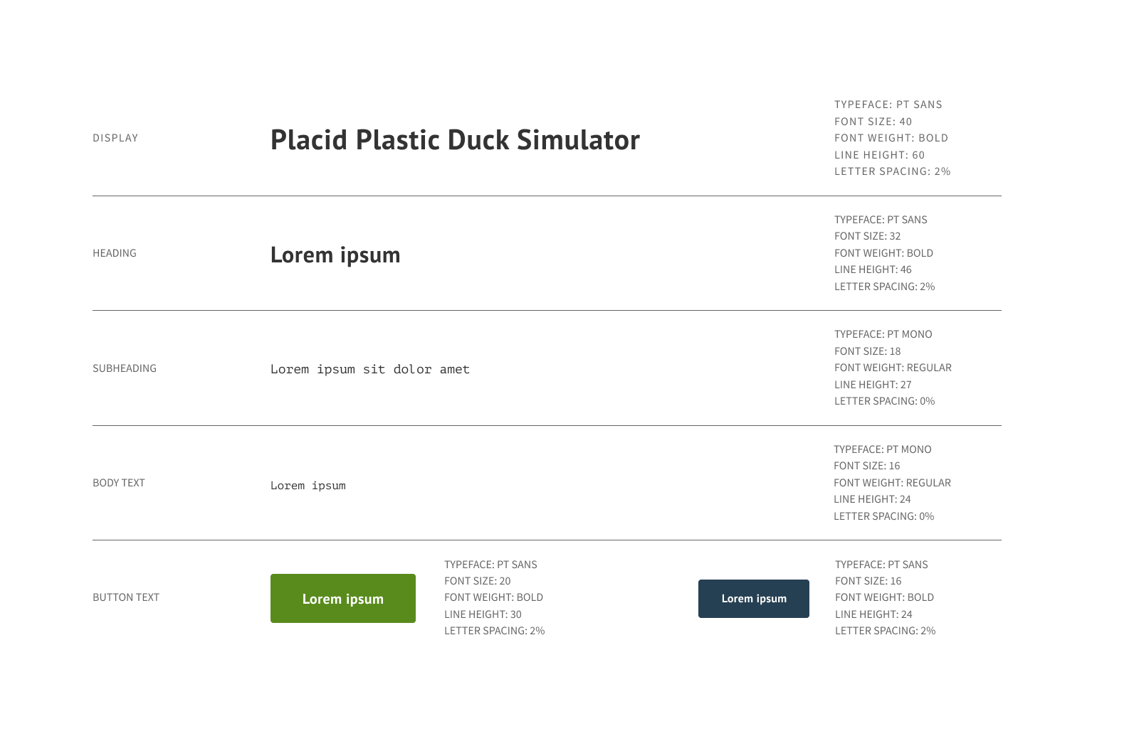
Image: Suggested Typography System
Typography System Accessibility Check
I recommend making subtle adjustments to the colours in the interface to enhance readability by achieving a more effective contrast ratio. The suggested colours align with the existing colour palette.
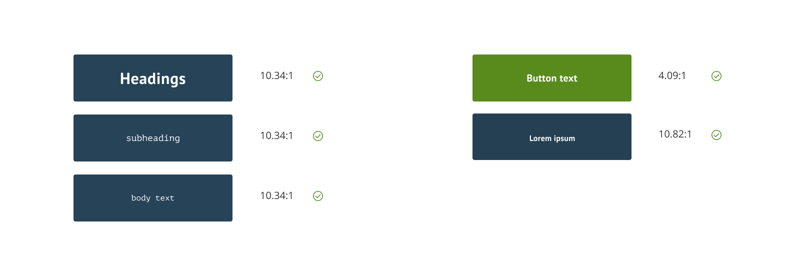
Image: Adjustement of colors to achieve better contrast ratio
03/ Key Takeaways and Evaluation
Developing this design system proved to be an incredibly engaging challenge. I found immense satisfaction in placing a strong emphasis on accessibility, which would not only enriched the user experience but also emerged as a key highlight in the insightful feedback I received from an expert:
“Hi Petra, thank you for your challenge submission! You did a great job, and we really appreciated how attentive you were to accessibility. The typefaces reflect a website’s authenticity as well. Well done! Thanks, Uxcel.“