
Minimalistic E-commerce Store
Role
Product Designer
Duration
October – Novermber 2022
Client
Tomas Marek
Tomas Marek operates a family-owned farm in the beautiful Vysocina region of the Czech Republic, dedicated to organic farming from the start. His previous self-designed e-shop featured premium bio chocolate, nuts, and spices. Tomas is committed to reducing environmental impact through sustainable practices, partnering with fair-trade farmers, recycling materials, and using plastic-free paper bags for packaging.
Tomas’s initial e-shop design was appealing but no longer met his technical and aesthetic needs. In 2021, we partnered to revitalise another of sites, creating a user-friendly, automated e-shop that truly reflected his naturalistic philosophy. By 2022, Tomas returned for a new design targeting the German market, aiming for a sleek, minimalistic look that aligned with his existing brand for a cohesive online presence.
I have designed a website that embodies simplicity and minimalism, perfectly aligned with eco-friendly and bio-conscious principles. The e-shop offers a seamless navigation experience, free from clutter and unnecessary distractions, while boasting technical features for both our customers and the client.
01/ Considering the Users
I conducted secondary research to understand the user, focused on sustainable shopping and bio products. According to this study, for example, consumers shopping for sustainable brands do so out of a desire to help the environment, mostly by reducing production, shipping and packaging waste. The reasons for preferring sustainable products, apart from environmental concerns (29%), are value (25%), brand authenticity (22%), and personal values (19%). An interesting finding is that pricing is not as important to consumers as retailers believe.
So, what are our two primary user stories?
1. As a person caring about nature, I want to shop for environmentally friendly products, and so I feel good about supporting sustainable businesses and fair trade.
2. As a health nut, I want to buy high-quality bio products, so that I can achieve my nutrition goals by eating a healthy diet free from preservatives, additives, or toxins.
02/ Starting the Design
I drafted a header that features a prominent logo and convenient anchors guiding visitors to various sections of the homepage. The secondary header provides quick access to email support, highlights shopping perks such as complimentary shipping and exclusive discount opportunities, and showcases a cart icon displaying the current number of items added.
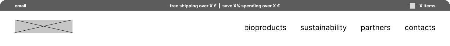
Image: Basic navigation draft for the store
Low Fidelity Wireframe
I created a lo-fi wireframe for the home page and product page focusing on a streamlined design for our limited product selection. The home page showcases all products and includes vital information on sustainability, packaging, and quality. The essential pages for product details, cart, and checkout will use default WooCommerce templates, refined to enhance the customer experience.
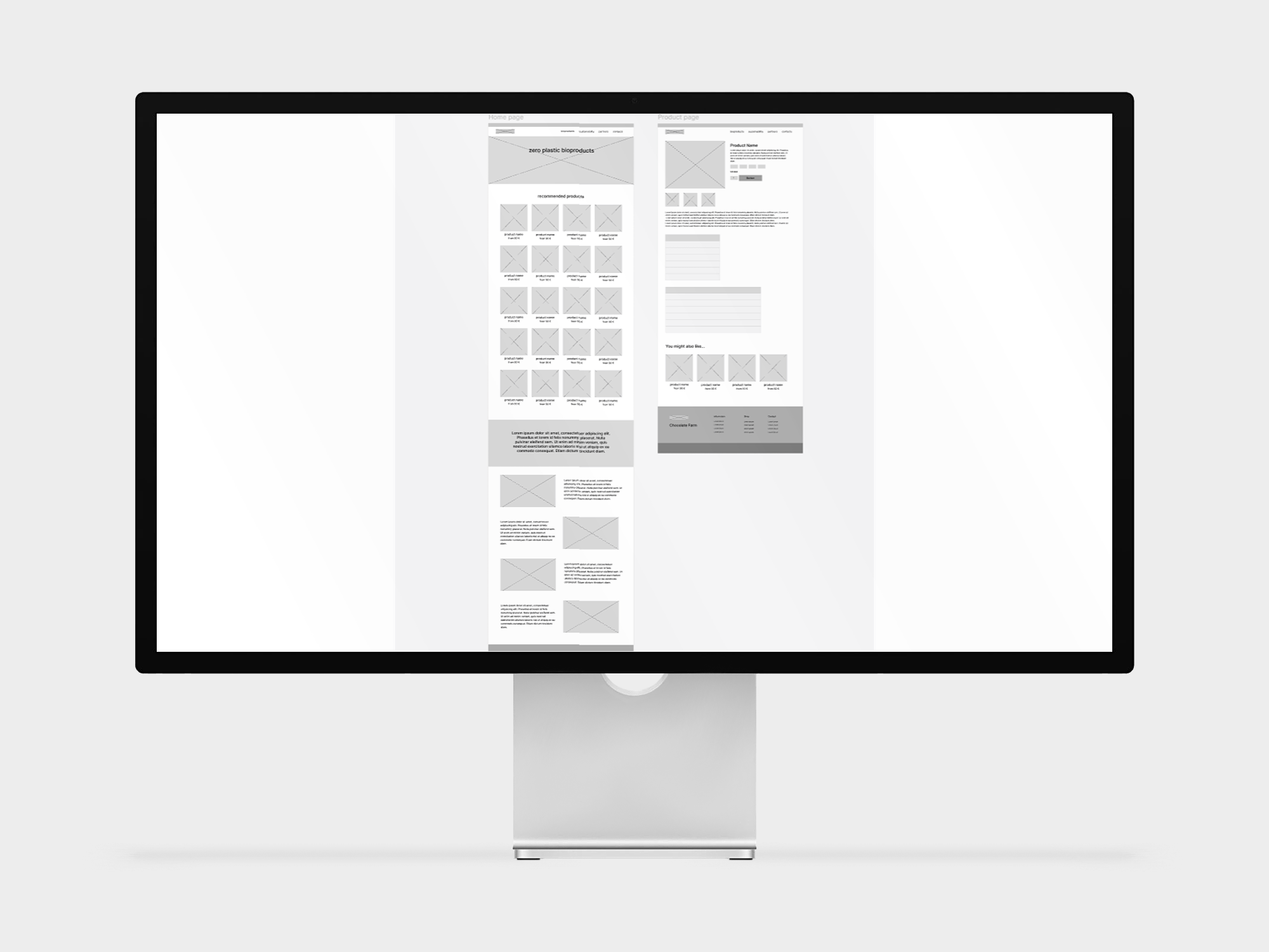
Image: Basic wireframes of home page and product page
03/ Visual Design
Typography and colors
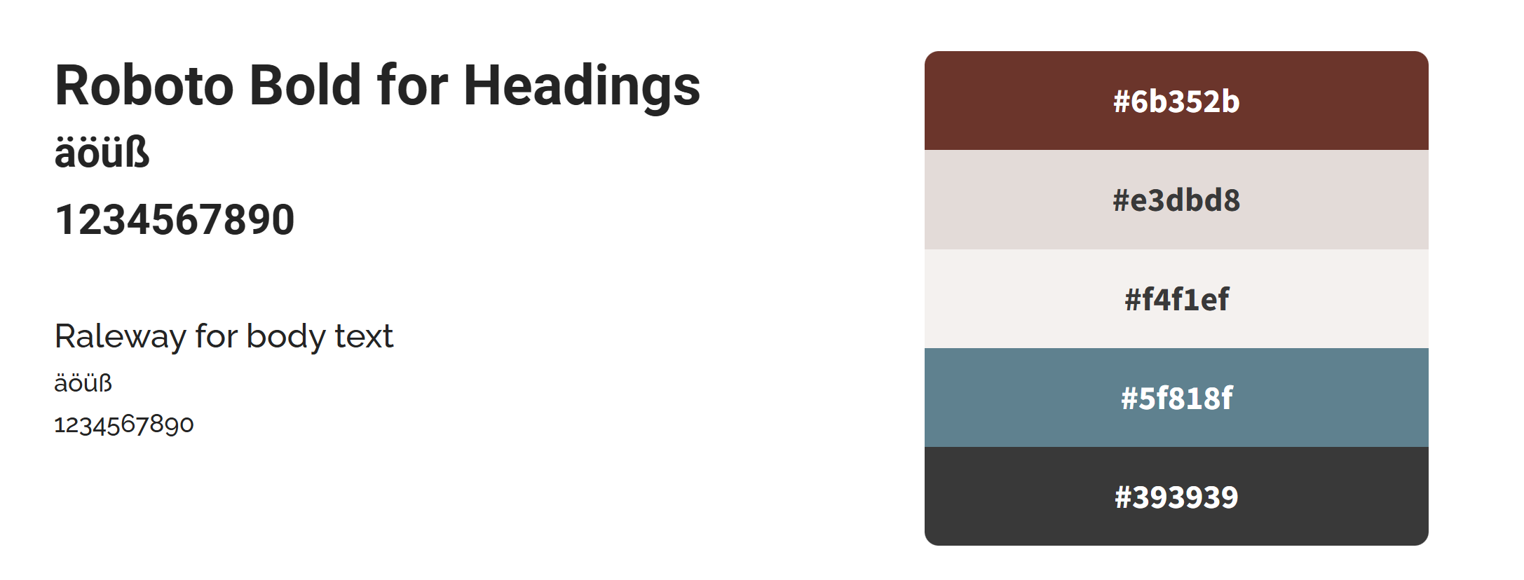
Image: Basic visual style
Mood and Imagery
The overall impression of the website should be “simplicity and minimalism”. For product pictures, only good quality, well-represented images would be used. The client was able to supply these and were of well suited to the design.
04/ Final design
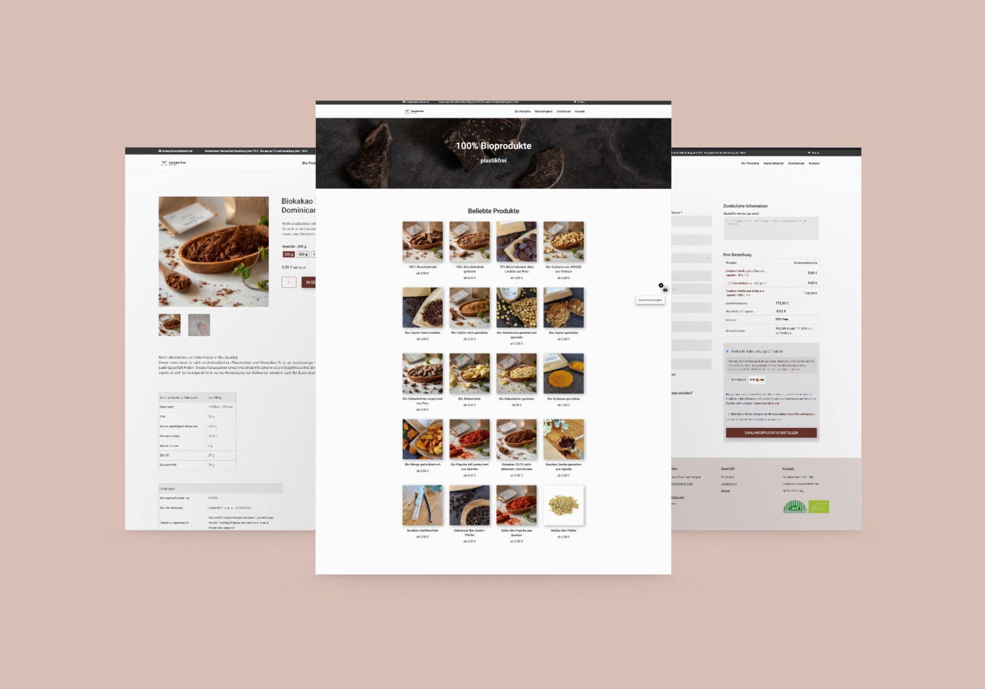
Image: Mockup of the final design
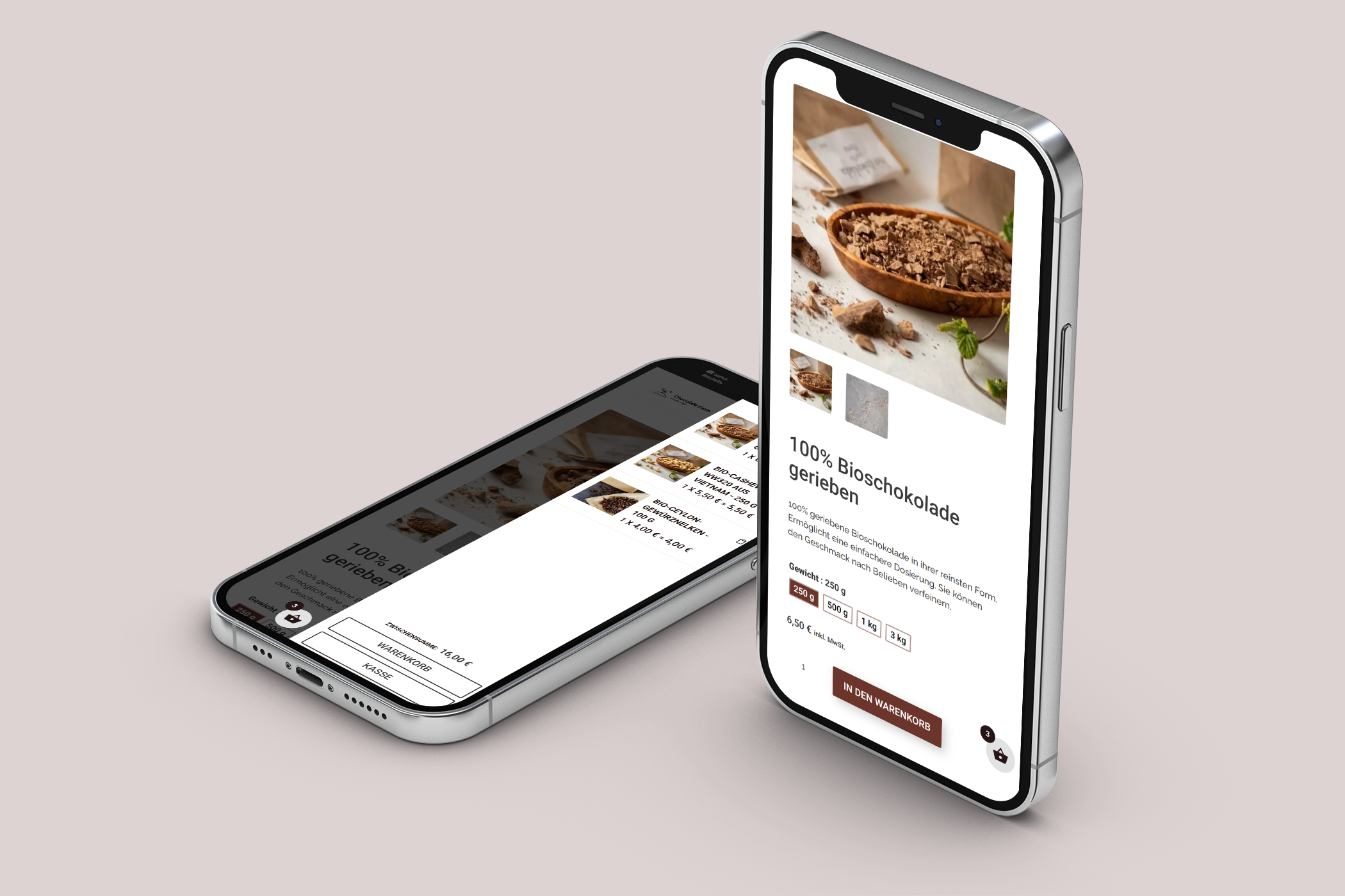
Image: Mockup of the final design
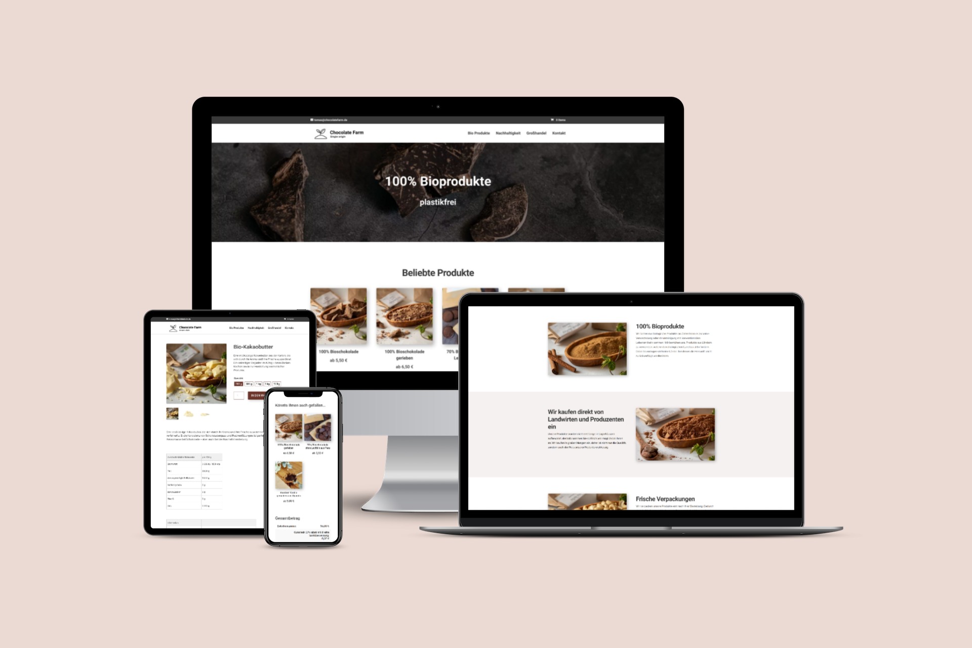
Image: Responsivity visualization (mobile, table, laptop, desktop)
05/ Technical Health
Core Web Vitals
Across both desktop and mobile platforms, our Core Web Vitals deliver good performance, enhancing user experience while boosting search engine visibility.
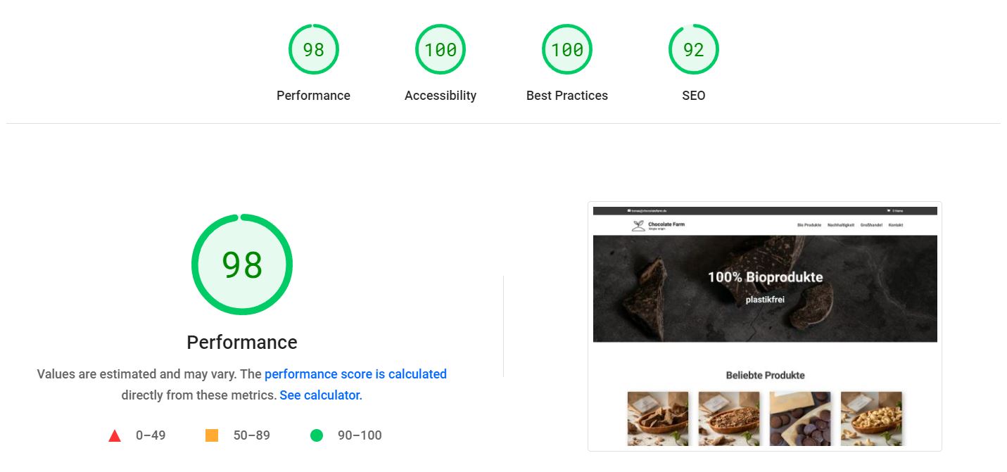
Image: Core web vitals – ecommerce desktop (performance 98, accessibility 100, best practices 100, SEO 92)
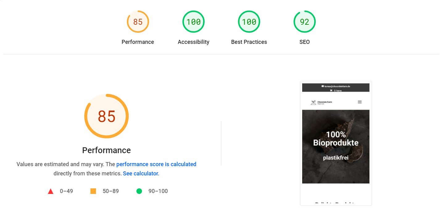
Image: Core web vitals – ecommerce mobile (performance 85, accessibility 100, best practices 100, SEO 92)
06/ Key Takeaways & What I learned
Tomas’s vision for a minimalistic design stood in stark contrast to the preferences of many of my other clients, who often lean towards more intricate and elaborate styles. This project truly captivated me due to its simplicity and elegance. I am happy with the final outcome; an elegant design that harmoniously embodies the principles of sustainability and organic products.
For the next steps, I suggest monitoring traffic consistently. Should any issues arise, such as a high bounce rate, I recommend conducting a usability study to identify the root cause and implement effective solutions.