
Blogger’s Website and Graphic Design
Role
Product Designer
Graphic Designer
Duration
February 2021 – April 2021
Client
Peter Ivanco
I created a simple blog-style website with a welcoming home page, a unified post layout, and a dedicated category archive. It features an author biography and essential contact details. After a few months, we enhanced the site with a new home page focused on affiliate products and reviews. My foresight in planning for future growth made it easy to add new pages or sections, ensuring a seamless flow of information throughout the site. By incorporating user feedback and analytics, we managed to create a website that meets client’s and users’ expectations.
01/ Understanding the User
Summary of user research
In this project, I conducted user interviews and mapped user journeys to understand the blog’s target audience. I identified a key group: adults over 40 facing challenges with weight loss due to a slowing metabolism.
To better address their needs, I created two personas, keeping their struggles and goals in mind throughout the product development process and future improvements.
Pain points
Through thorough research and analysis, I have pinpointed the key pain points that need to be addressed on the website to enhance user experience, engagement and overall success.
No time to eat a balanced diet
Our users are busy individuals who struggle to find time for a balanced diet. They often grab unhealthy food on the go and tend to overeat at home in the evening.
Lack of motivation
The users claim they struggle to motivate themselves to change their lifestyle, which means eating a healthy diet and doing some regular exercise.
Low energy levels
Users say they feel tired and have no energy to do some physical activity after a long day at work, or due to their family schedule.
Users claim they struggle with physical and mental health. Apart from overall fatigue, they often live in pain (muscle, joints, internal organs).
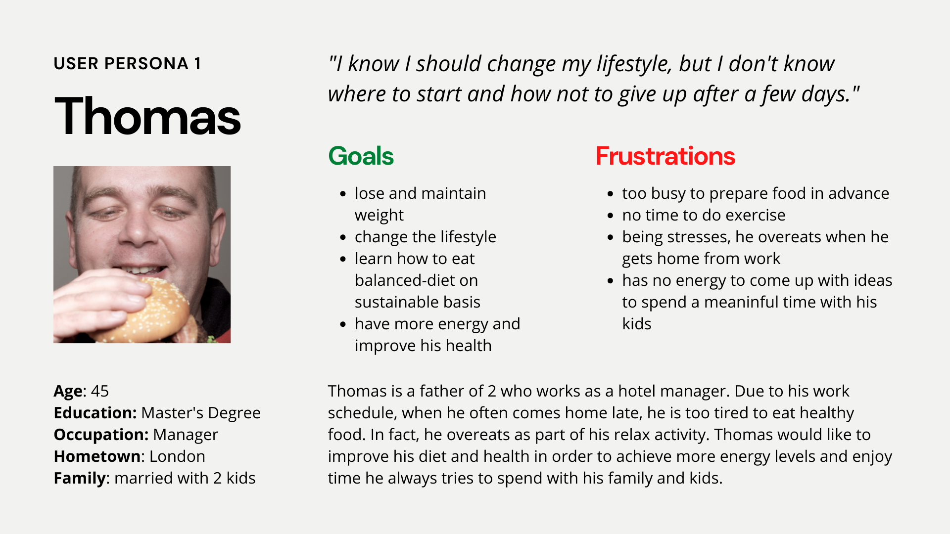
Persona 1: Thomas
Thomas is a busy manager who wants to lose weight and improve his overall lifestyle, so he has more energy and can spend quality time with his wife and two kids.
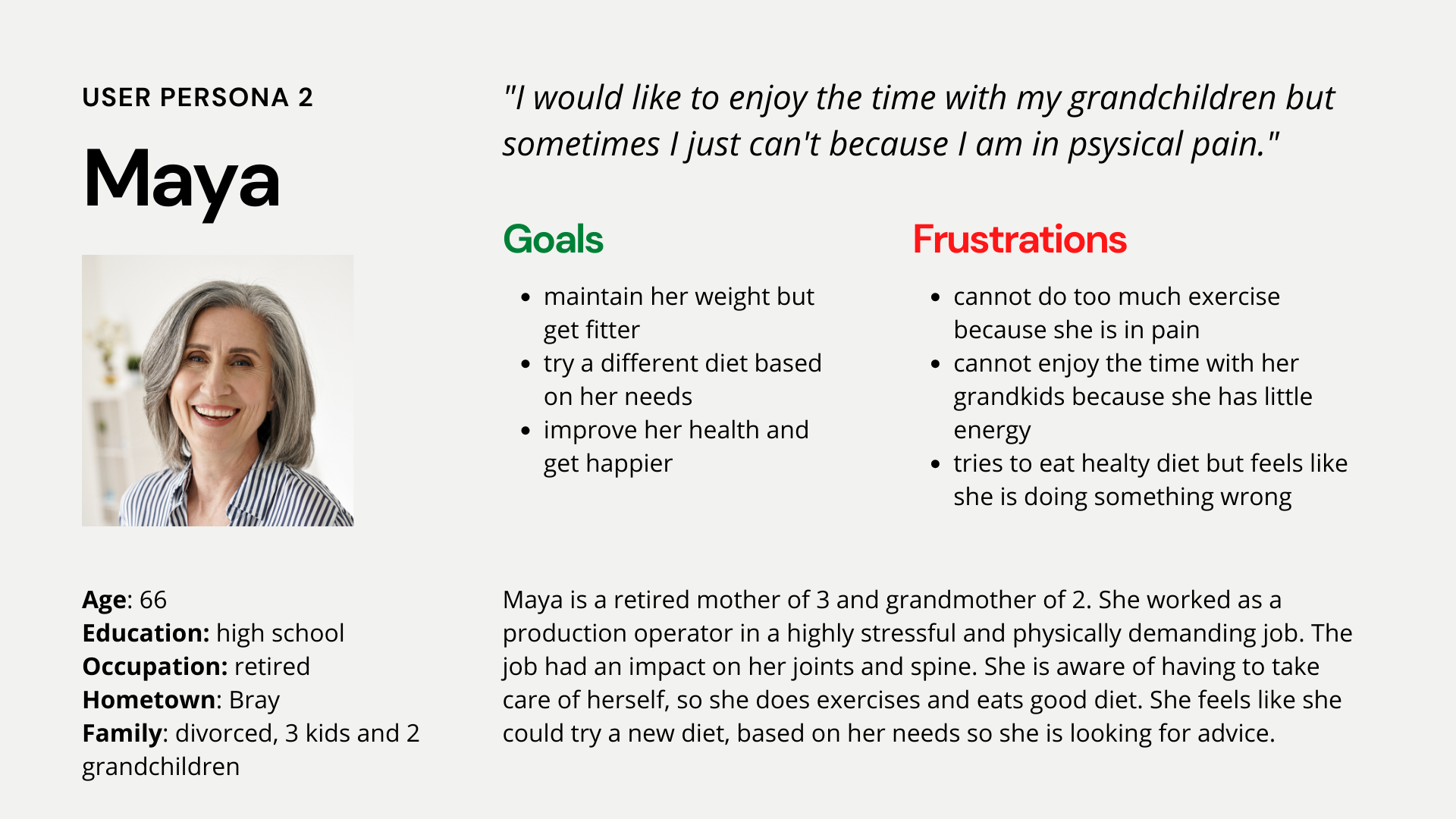
Persona 2: Maya
Maya is a grandmother to two children, and is looking to change her diet to improve her health and can then spend more time with them.
02/ Starting the design
Initial draft
I crafted wireframes for three pages. The first is a blog page showcasing featured posts, organised categories, and a comprehensive list of articles. Next, there’s a post page designed to highlight related content while providing ample space for advertisements. Finally, the about page narrates Peter’s journey, detailing the services he offers alongside his inspiring story, complete with captivating before-and-after images that illustrate his lifestyle transformation. Each page concludes with a lively Facebook feed and additional advertising space to maximise engagement.
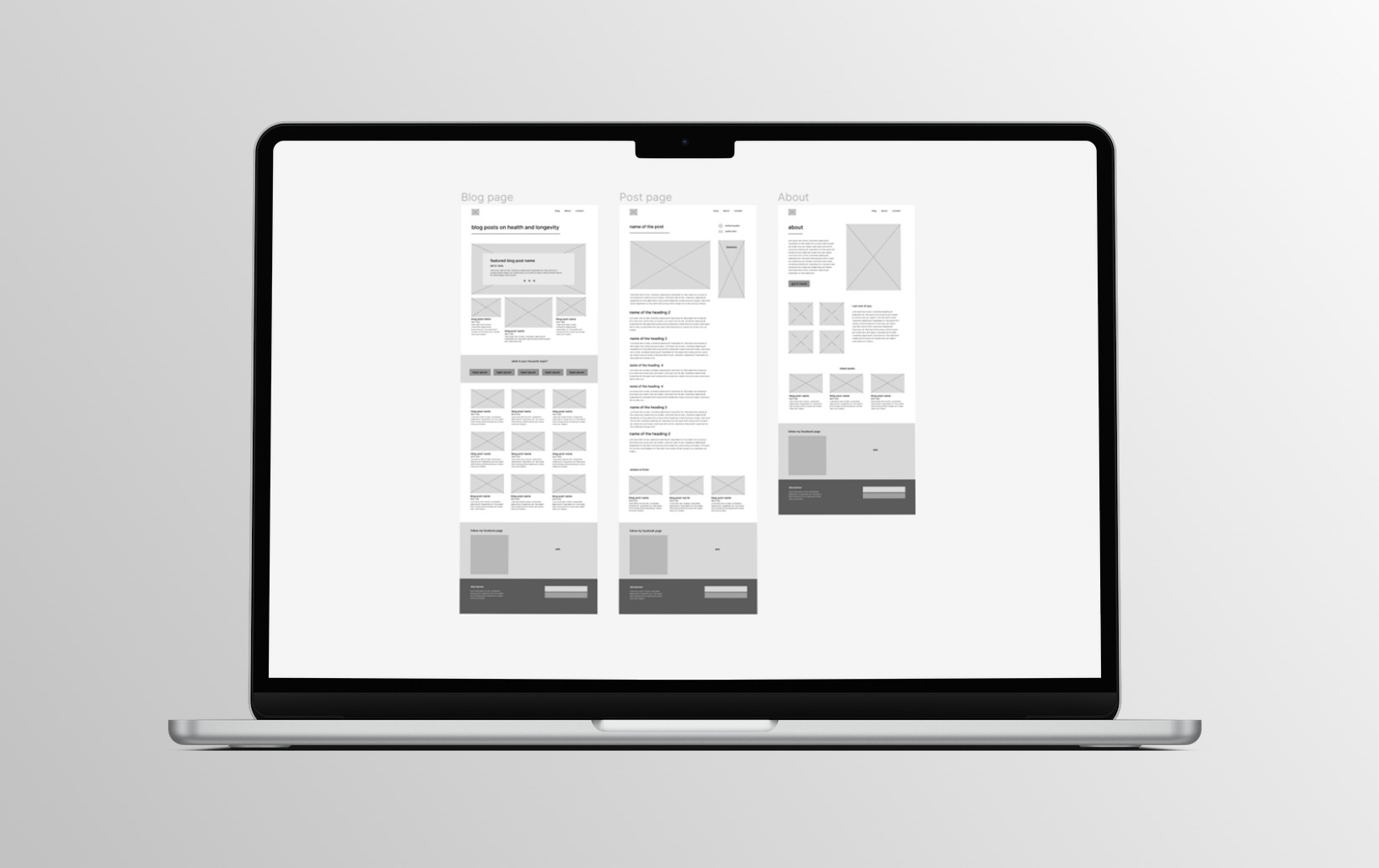
Image: wireframes for three basic pages of the website
Wireframe for an expanded website
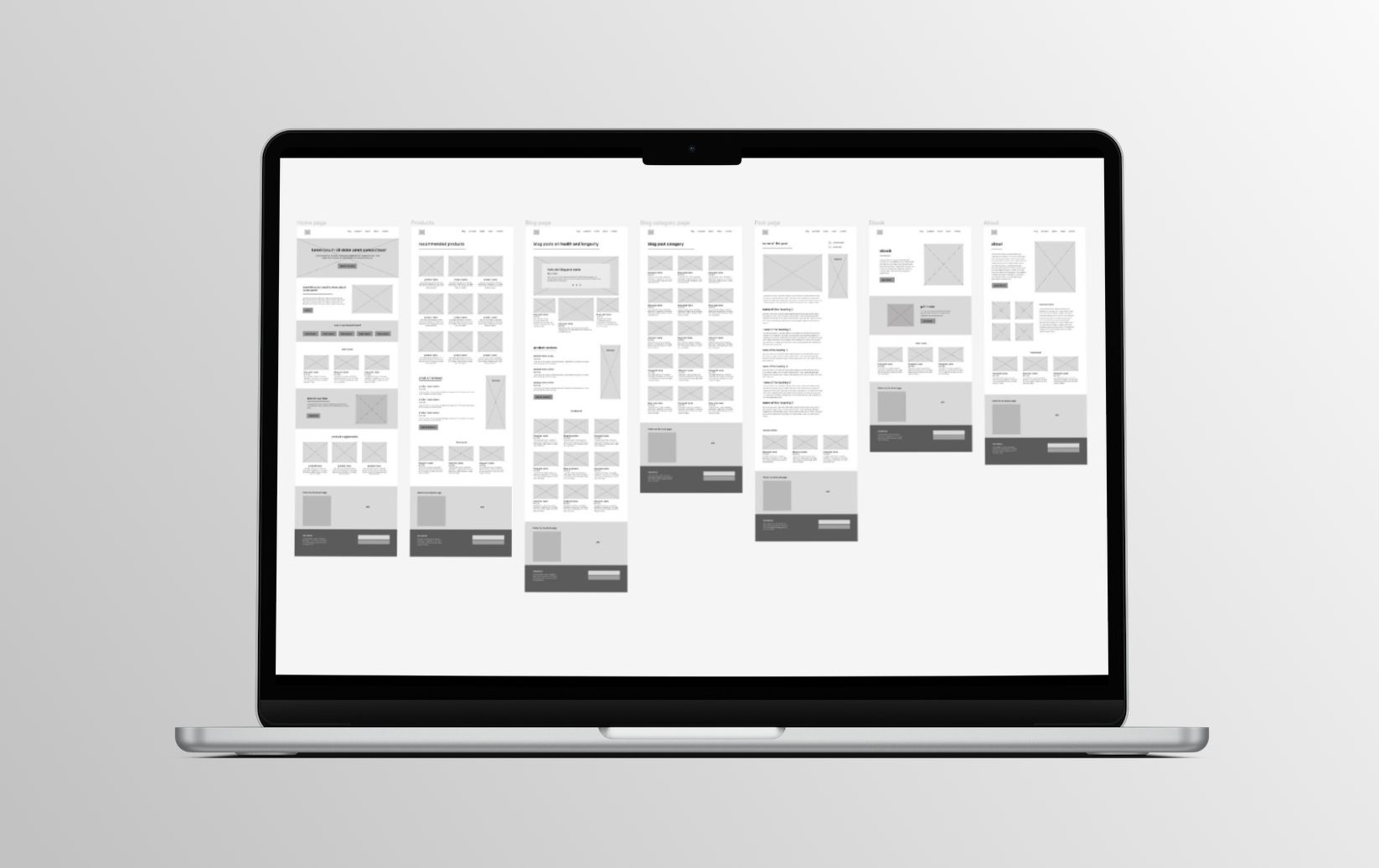
Image: wireframes fro expanded website
Typography and colors
I chose the combination of Montserrat for headings and Open Sans for text, to ensure a modern look and readability, especially in blog posts. For graphic designs, I chose League Spartan (similar to Montserrat) and Jonathan for easy recognition of the brand. As Jonathan is not as easy to read, it will be used just for decoration or up to 3-word informational texts.
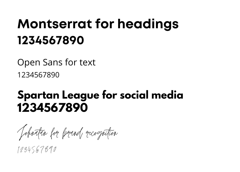
Image: typography visualization

Image: basic color palette
03/ Final Design
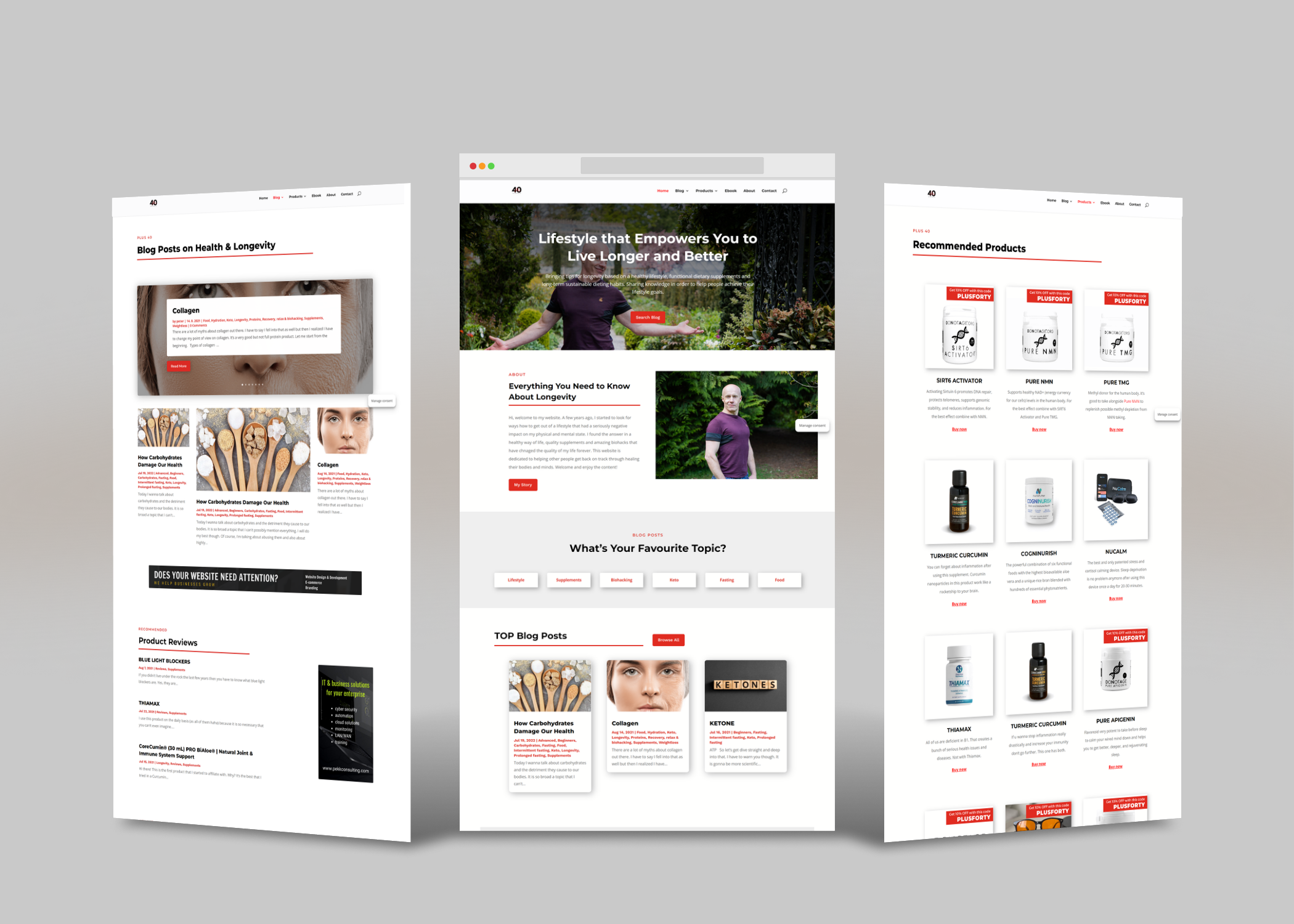
Image: Mockup of the final design of the blogger’s website
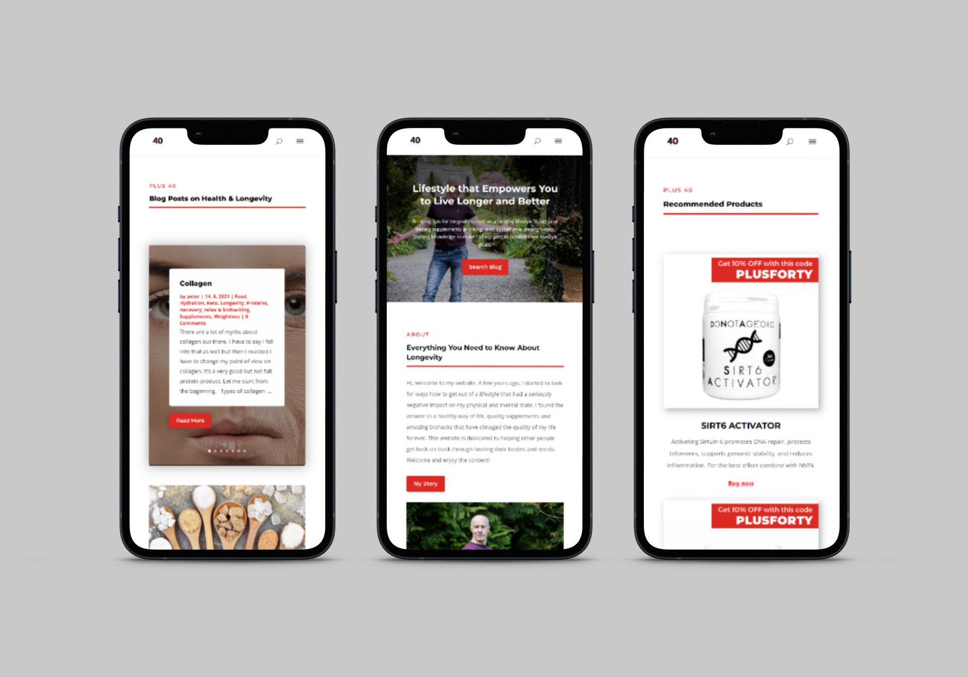
Image: Mockup of the final design on mobile devices of the blogger’s website
04/ Digital and Print Graphic Design
I designed a versatile logo in both light and dark modes, crafted engaging LinkedIn profile graphics, created a series of eye-catching Facebook posts, developed an informative e-book, and produced stylish business cards. Each element is harmoniously aligned to elevate the client’s brand identity.
Image: Simple logo for the blogger’s website
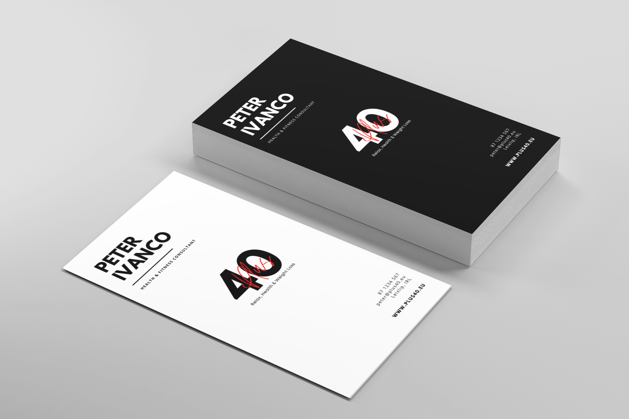
Image: Business cards
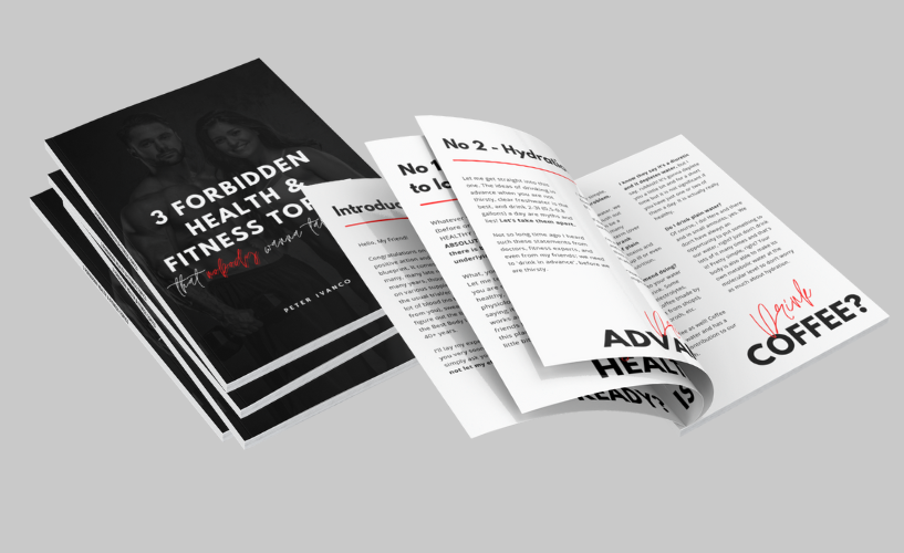
Image: eBook design
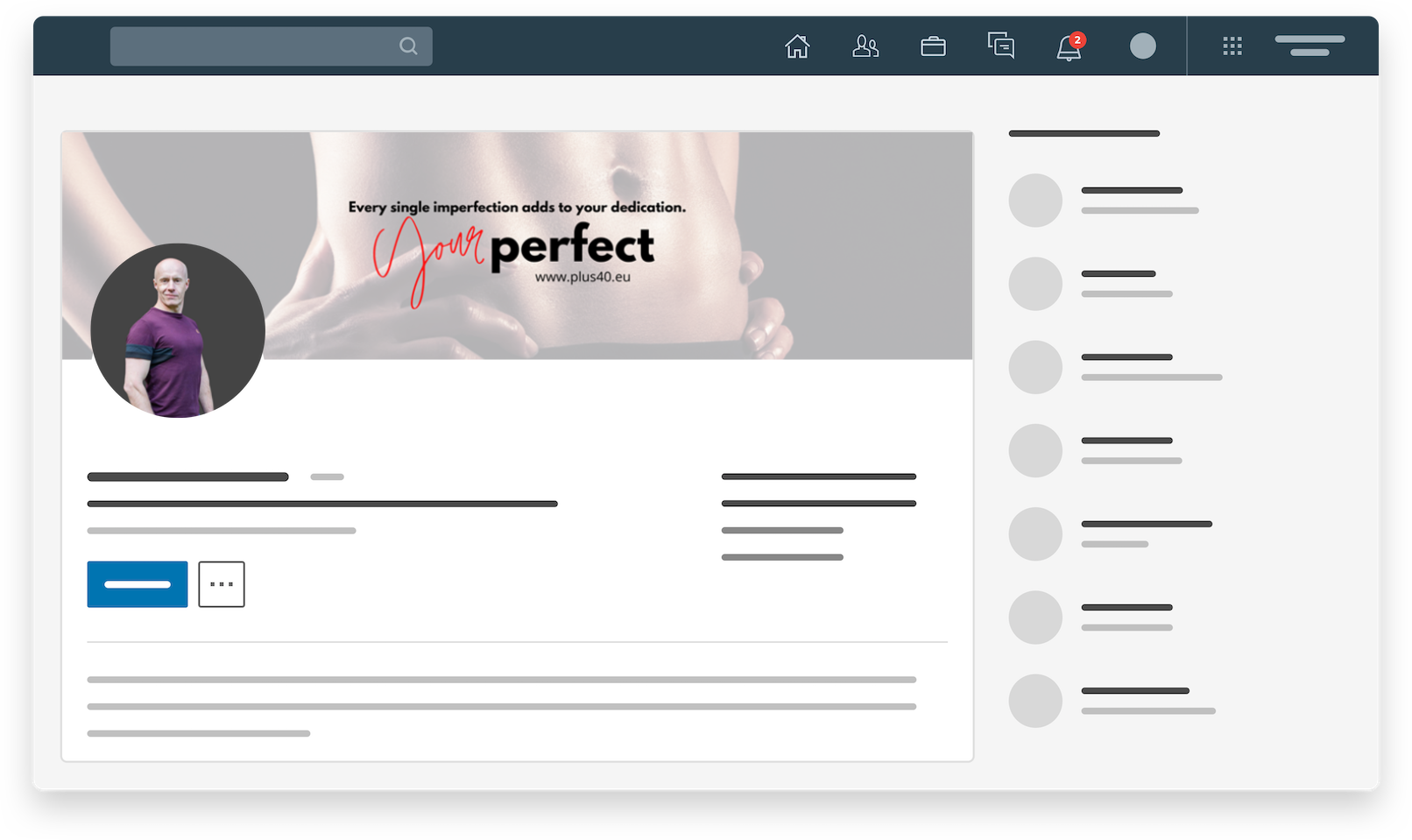
Image: Social media – LinkedIn
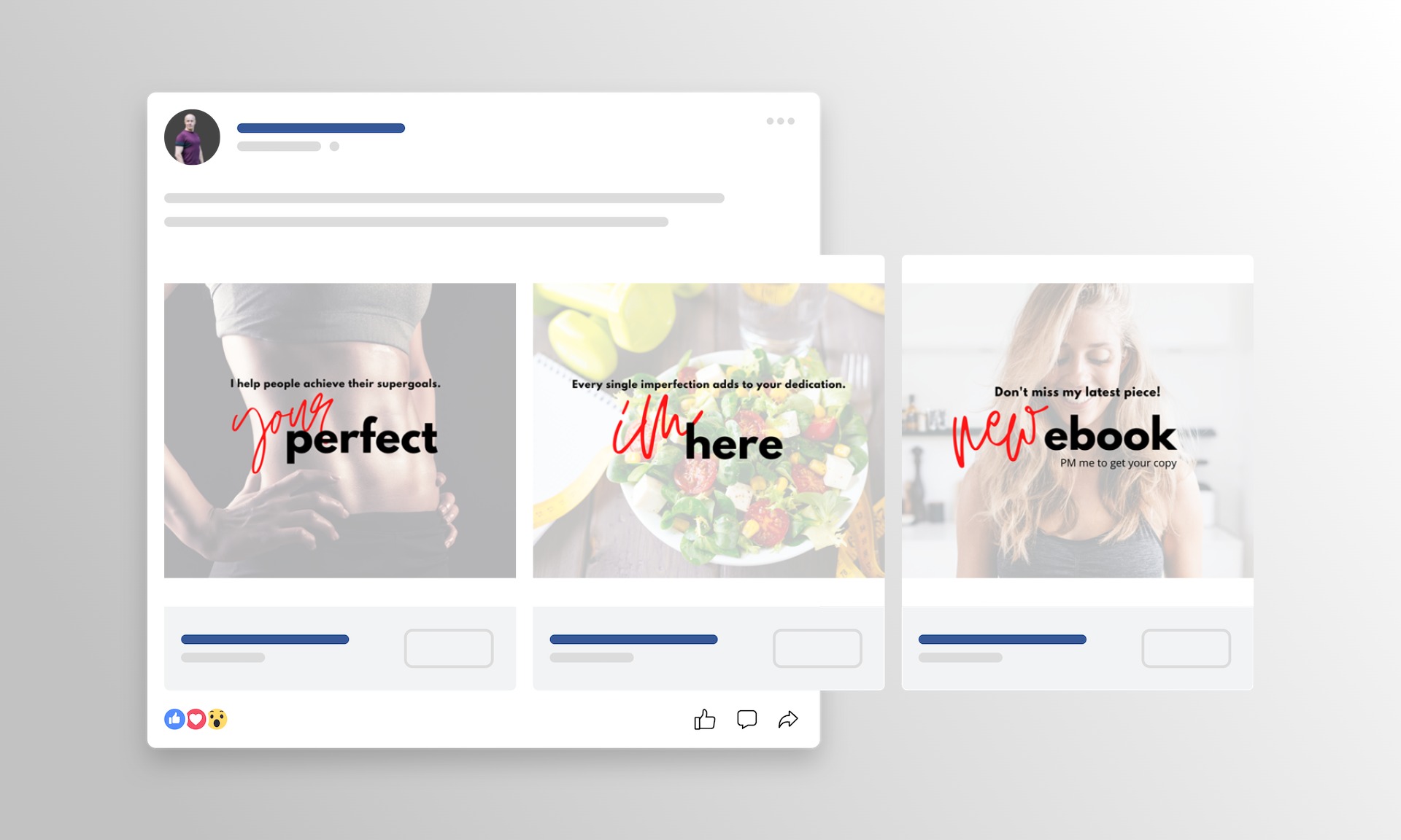
Image: Social media – Facebook
05/ Key Takeaways & What I learned
I view the results of this collaboration as a significant achievement. The website has empowered the client to launch his business successfully, making a notable impact by sharing valuable insights on lifestyle changes.
One of the more challenging aspects was guiding the client in the art of blog writing. I organised several training sessions focused on crafting engaging and user-friendly content that also performs well in search engines while remaining accessible.
Looking ahead, I suggested implementing ongoing research and gathering user feedback on blog posts, conducting regular on-page SEO reviews, and developing a content strategy driven by data. This approach would reflect traffic analysis outcomes and help concentrate on topics that resonate most with the target audience.